.png)
Key Takeaways
- Competitor comparison pages convert at 7.5%+ on average — roughly 15x a standard blog post — because they meet buyers at the decision moment, not the awareness moment.
- Intent matching is the biggest lever. A single "X vs. Y" page cannot serve comparison shoppers, problem-aware buyers, and switchers equally. Build for one dominant intent per page.
- Honest comparisons earn trust. Pages that acknowledge where the competitor wins convert better than pages that only punch.
- AI search has rewritten the rules. 51% of B2B software buyers now start their research with an AI chatbot, and 45% say review-site citations are the most trusted signal in an AI-generated answer.
- Design-level details compound. Sticky CTAs, schema markup, mobile parity, and a named-competitor FAQ block quietly do the heavy lifting on conversion.
- Want comparison pages that rank and convert for B2B SaaS? Book a strategy call with TripleDart, an AI-native SaaS marketing agency that measures success in pipeline, not pageviews.
The Formula for High-Converting Competitor Comparison Landing Pages
You've spent months building a better product. Better features, better support, better pricing. But when a prospect types "Your Brand vs. Competitor" into Google, the top result is a Reddit thread, a listicle from a site you've never heard of, or worse... your competitor's own comparison page.
That's high-intent, ready-to-convert traffic flowing into a narrative someone else wrote. And you're not even in the room.
A well-built competitor comparison landing page fixes that. It becomes the place where you steer the conversation, build trust on your terms, and close the deal before a sales rep ever gets involved.
Here's the problem: most B2B SaaS brands get these pages wrong. They oversell, they trash the competitor, or they skip the nuances that a shortlisted buyer cares about. The result is a page Google buries on page two and AI chatbots refuse to cite.
In this guide, we share our SaaS SEO playbook for building competitor comparison landing pages that rank, earn AI citations, and convert high-intent traffic. This is battle-tested by TripleDart Digital, an AI-native SaaS marketing agency, across 250+ B2B SaaS accounts.
Let's get started.
Why Do Comparison Pages Convert at 15x the Rate of Blog Posts?
Competitor comparison pages meet a buyer at the exact moment they are choosing between named options. The blog, the homepage, the feature pages — all of that is a warm-up. The comparison page is where the decision happens.
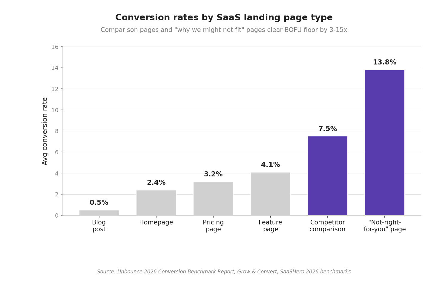
The 2026 Unbounce Conversion Benchmark Report puts a number on it. The average B2B SaaS landing page converts at 2–5%. Competitor comparison pages land at 7.5%+. And pages with the format "Why [product] might not be right for you" convert at 13.8% per Grow & Convert, because honesty earns clicks the category average cannot.
Meanwhile, landing pages in SaaS contexts have an average conversion rate of 26%, with 67% of marketers achieving over 10%. But only when the page matches the buyer's exact stage. Comparison pages do that by default.
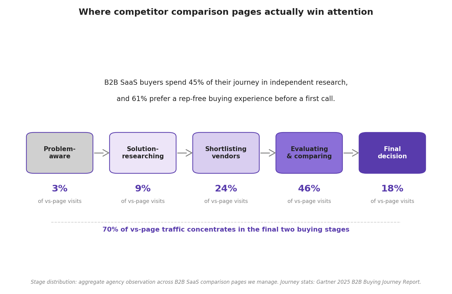
The buyer behavior behind those numbers has changed too. A Gartner B2B buying report finds 61% of B2B buyers now prefer a rep-free buying experience before they ever meet a vendor.
They compare on your site, on review sites, and inside an AI chatbot — alone. Your comparison page is often the only asset carrying your voice into that private evaluation room.
Agency Insight
Across our 250+ B2B SaaS accounts, pages optimized with competitor comparison tables and first-party survey data averaged 47% higher conversion rates from organic traffic compared to standard product pages, capturing bottom-funnel searches like "tool A vs tool B" that drive 3x more demo requests.
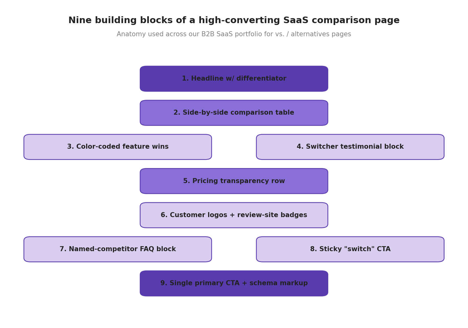
What Is the 5-Step Formula for an Effective Competitor Comparison Page?
The formula breaks into five strategies: context, clarity, credibility, conversion, and continuity between rankings and revenue. We use all five across the B2B SaaS portfolio at TripleDart. Here is each one in detail.
1. How Do You Target the Right Search Intent?
Not all comparison searches mean the same thing. Some users want a straight feature-by-feature breakdown. Others are trying to solve a pain point and need reassurance. And some are already using a competitor, looking for a reason to leave.
If your comparison page treats all three the same, you leave conversions on the table.
a. Comparison Shoppers
These users search for "X vs. Y" to compare them side-by-side. They care about pricing, integrations, scalability, support, and features. They want facts that help them close the final decision.
A searcher typing "Shopify vs. WooCommerce" is comparing features, costs, and usability to decide which platform fits their business. The goal is to give them a clear, unbiased comparison table that presents complex data — not marketing claims.
A Grow & Convert analysis found that "versus" keywords had the second-highest average conversion rate at over 5% among bottom-of-funnel SEO content types. That's the power of matching this specific intent.
b. Problem-Aware Users
This group is less concerned about a head-to-head between two products. They want to know which one solves their problem better. Your content should address their pain, not your perks.
These users often search for "[Competitor] alternatives" or "best [category] for [use case]."
c. Switching Intent
They've already tried a competitor's product and are looking for a reason to leave. Your job is to show them why switching is worth it. A comparison page for this audience should focus on the competitor's weaknesses — gently — and highlight where your product fills the gap.
Say someone searches "Stripe vs PayPal for small business." They're likely dissatisfied with PayPal's fees or support, and they need a clear, concrete reason to switch to Stripe.
Next time you build a comparison landing page, ask: Who is searching for this, and what are they hoping to find? Addressing the right intent is the single biggest lever on conversion rate, trust, and engagement.
This Reddit thread captures the real-world debate well — SaaS founders sharing whether comparison pages are worth the investment and how they've structured them for different intent types: Comparison pages - worth it? (r/SaaS)
Agency Insight
Keyword gap analyses targeting high-intent "vs" queries underserved by competitors yielded a 62% uplift in qualified leads for accounts implementing dedicated comparison landing pages, prioritizing search volume and buyer intent over broad informational terms.
2. How Should You Structure the Page for Instant Clarity?
Users don't read — they scan. If they can't immediately find what they're looking for, they leave. A cluttered or overly salesy comparison page kills conversions before they start.
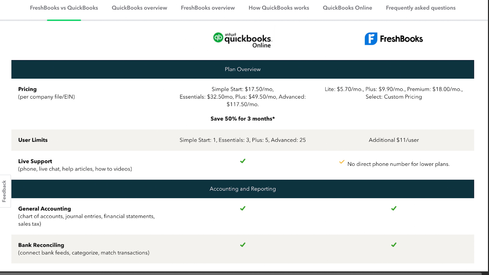
The most critical information — pricing, features, support options, and integrations — needs to be prominently displayed. Place a clear, side-by-side comparison table at the top that touches all four.
The type of comparison table you use depends on your product and the angle you're pushing.
Short and concise tables: Best when you have a few key features to compare.
Long and detailed tables: Great when you need to show that your product offers more features at a similar price.
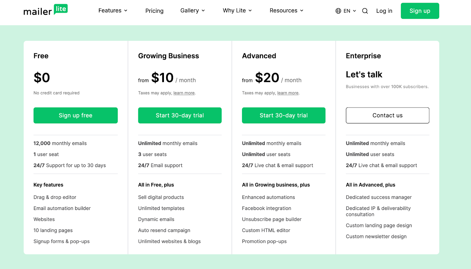
Explanatory tables: Use this format to explain why your features add more value than the competitor's. The copywriting inside your comparison table is as crucial as the features you highlight.
Compelling headlines: The headline sets the tone and shapes perception. A headline like "Our product is cheaper than the competition" immediately frames your product as the better deal.
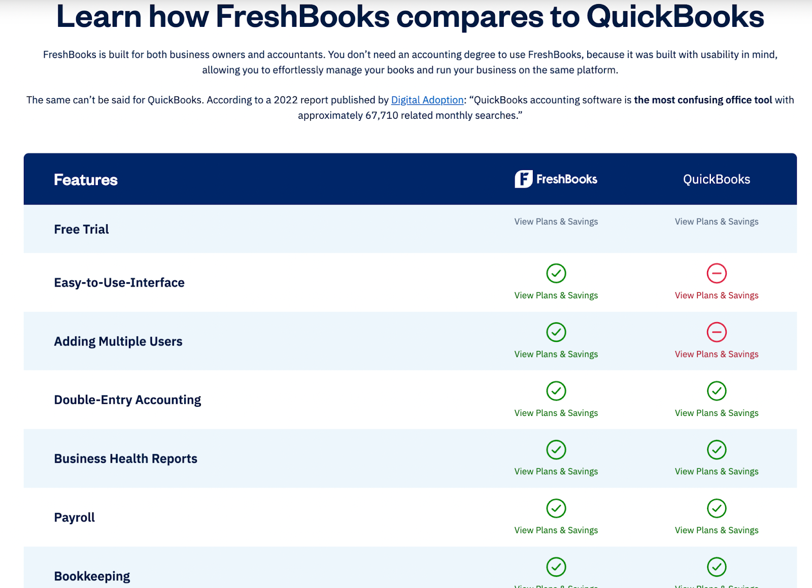
You can support this with text explaining why your product excels. For example, FreshBooks positions itself as more user-friendly than QuickBooks, which often requires accounting knowledge.
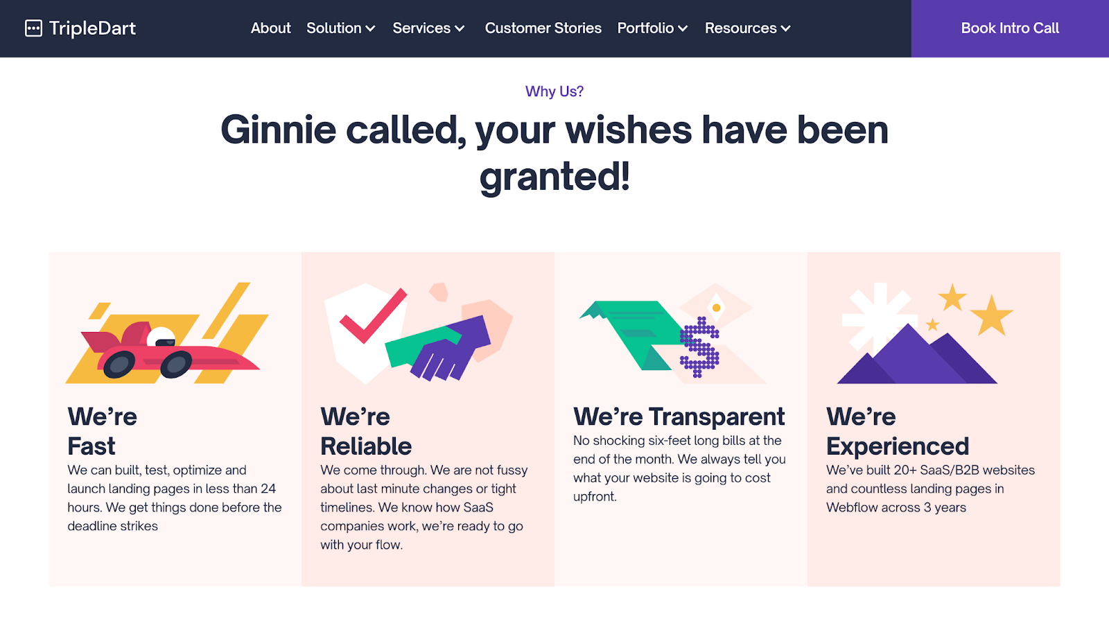
Unique selling points (USPs): Highlight this section visually using bold typography, a different background color, or design elements that set it apart from the rest of the page. This section should immediately answer the user's question: "Why Choose Us?"
Take a look at how TripleDart Digital does this:
Social proof: Address the specific pain points your product solves and explain them clearly. Support your claims with case studies, customer testimonials, and industry awards your product has earned.
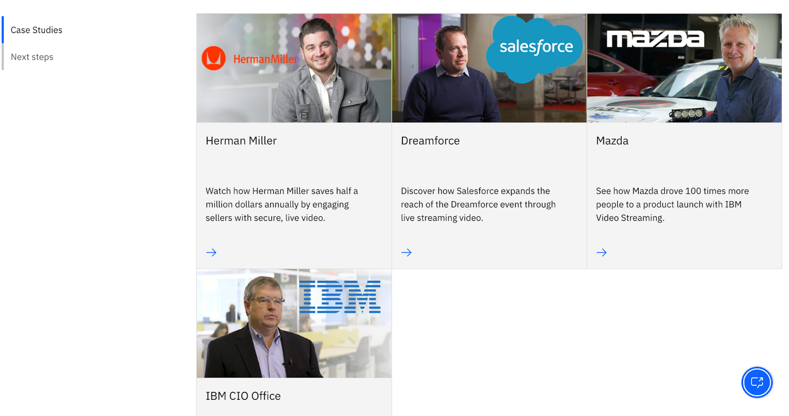
Most brands use text for testimonials, but video testimonials are a powerful way to showcase authenticity. If you use video, summarize key takeaways in text — the way IBM does it.
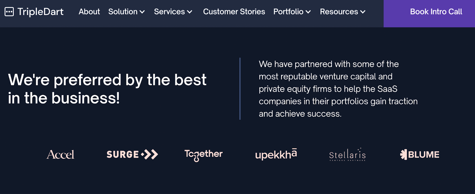
Customer names and logos: If you've worked with recognizable brands, don't hold back. Comparison pages are the right place to flaunt high-profile clients and boost credibility.
Pro tip: To make the comparison easy to scan, use color-coded highlights. Green for your strengths, neutral gray for the competitor's features. This small design trick helps users process the differences quickly without feeling sold to.
3. How Can You Address Competitor Strengths Without Overselling?
To build trust on a comparison page, avoid exaggerated claims. Saying "We're better" without proof weakens credibility. Prospects can smell it.
Instead, approach the competitor's strengths strategically and use them to highlight your product's advantages.
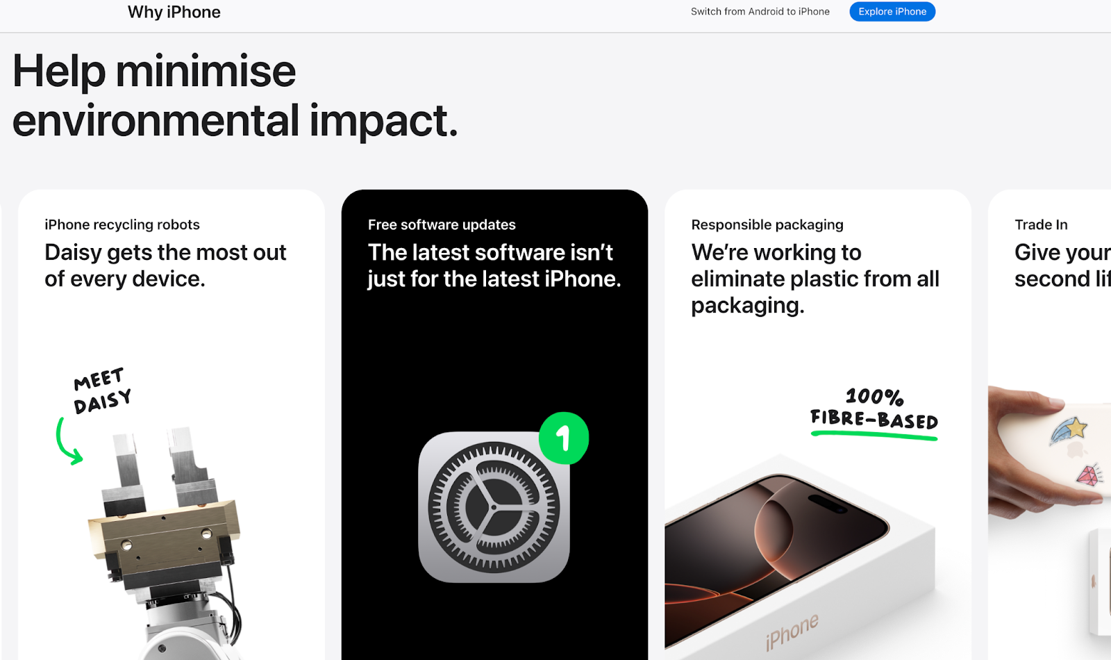
Apple does this on its iPhone comparison page. Rather than criticize Android, Apple highlights its integration of hardware and software as an advantage over Android's fragmented approach. The comparison feels confident, not combative.
You can apply the same principle by using testimonials that show contrast. A side-by-side testimonial block — one quote from a customer frustrated with the competitor, another praising your product — works well.
For example: "Customer A felt lost with the complexity of Competitor X, but Customer B found our product intuitive and easy to navigate from the start."
Or look at how ClickUp does it:
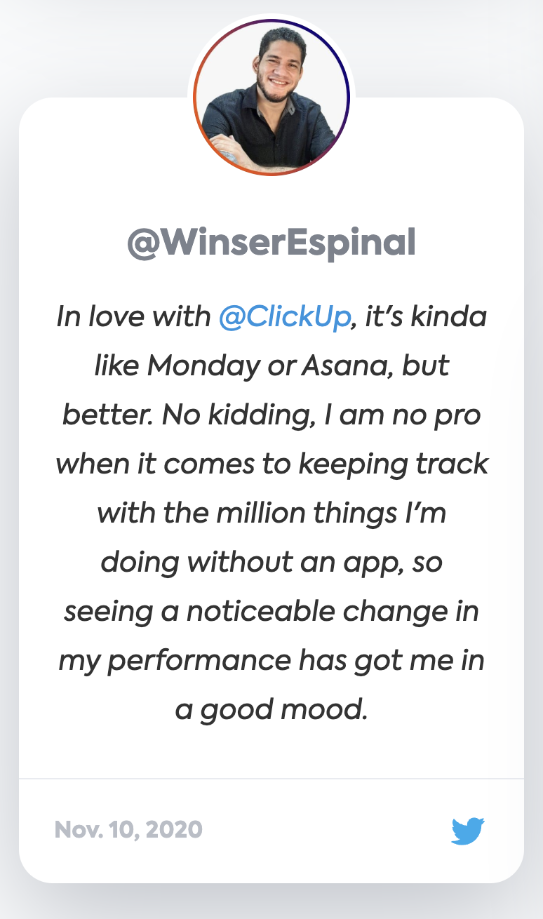
By addressing a competitor's strengths with honesty and presenting them in a way that reinforces your product's advantages, you build credibility and keep the conversation grounded in real user needs.
4. How Can You Use Customer Proof and Case Studies Effectively?
Bold claims need real proof. Otherwise they're empty words. The most effective comparison pages reinforce differentiators with data, case studies, and customer stories that show results — not promises.
ActualTech Media detailed their switch from Slack to Microsoft Teams in a candid blog post. They shared positive experiences with Teams' contextualization and file-sharing while acknowledging challenges like notification issues and weak archiving. This candid feedback boosts authenticity and shows the genuine trade-offs involved in switching.
Numbers speak louder than words. Provide concrete data to support your claims. TripleDart Digital uses SaaS SEO case studies that highlight tangible results. Simple statements like:
- "Rezolve.ai achieved a 105% increase in clicks from organic search."
- "Users who switched to us reduced churn by 32% within 3 months."
These catch attention and convince prospects to switch.
Or, offer punchy success stories from customers who switched to you. This format is direct and gives prospects quick, easy-to-digest insights into how others like them benefited.
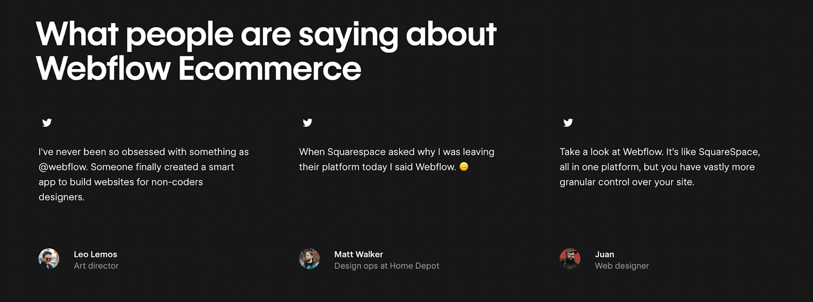
HubSpot features a section with brief customer stories about users leaving competitors like Marketo or Pardot:
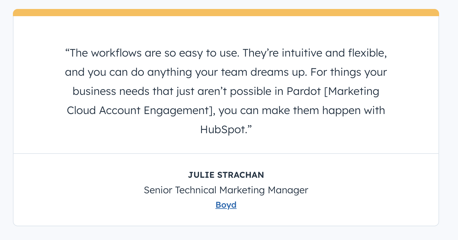
These bite-sized success stories highlight why customers switched and what improvements they saw after.
Case Study - SalesDuo
"SalesDuo saw a 5x increase in competitor campaign conversion rate, from under 1% to 4-5%, alongside a 2x increase in competitor campaign CTR, from approximately 4% to 8-10%."
Read the full SalesDuo case study →
5. How Do You Optimize for Both SEO and Conversion?
When building competitor comparison landing pages, you need to optimize for SEO and conversion at the same time. Start by targeting high-intent keywords like "Competitor vs. Your Brand" or "Competitor Alternatives." Place them in the URL, page title, meta description, and H1 for ranking visibility.
Another key element: structured data. Google rewards it, especially for comparison tables, which can earn you rich-snippet real estate. Tools like Schema.org help you structure tables for better visibility and for answer engine optimization inside AI search.
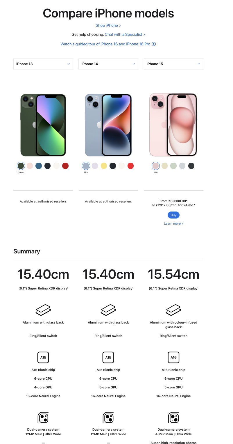
Create multiple comparison pages, even if you don't have branded competitive search terms. Compare your brand against well-known competitors — Apple's landing page, which compares its iPhone models (e.g., iPhone 13 vs. iPhone 14 vs. iPhone 15), is a strong template.
Use interlinking to your advantage. It drives traffic to your comparison pages from related blog posts or product pages. If your product is mentioned in a blog about competitor analysis, link to your comparison page for deeper insights. This improves your on-page SEO and raises the odds of converting that traffic.
Once you've optimized your SEO strategy, make sure you're converting that traffic too.
Use sticky CTAs — a "Try [Your Product] Free" button that stays visible as users scroll. It keeps your product top-of-mind without being intrusive. Offer a competitor switch incentive like "Get 3 Months Free When You Switch" to nudge users over the line.
TripleDart uses a persistent "Book a Call" CTA placed throughout our landing pages.
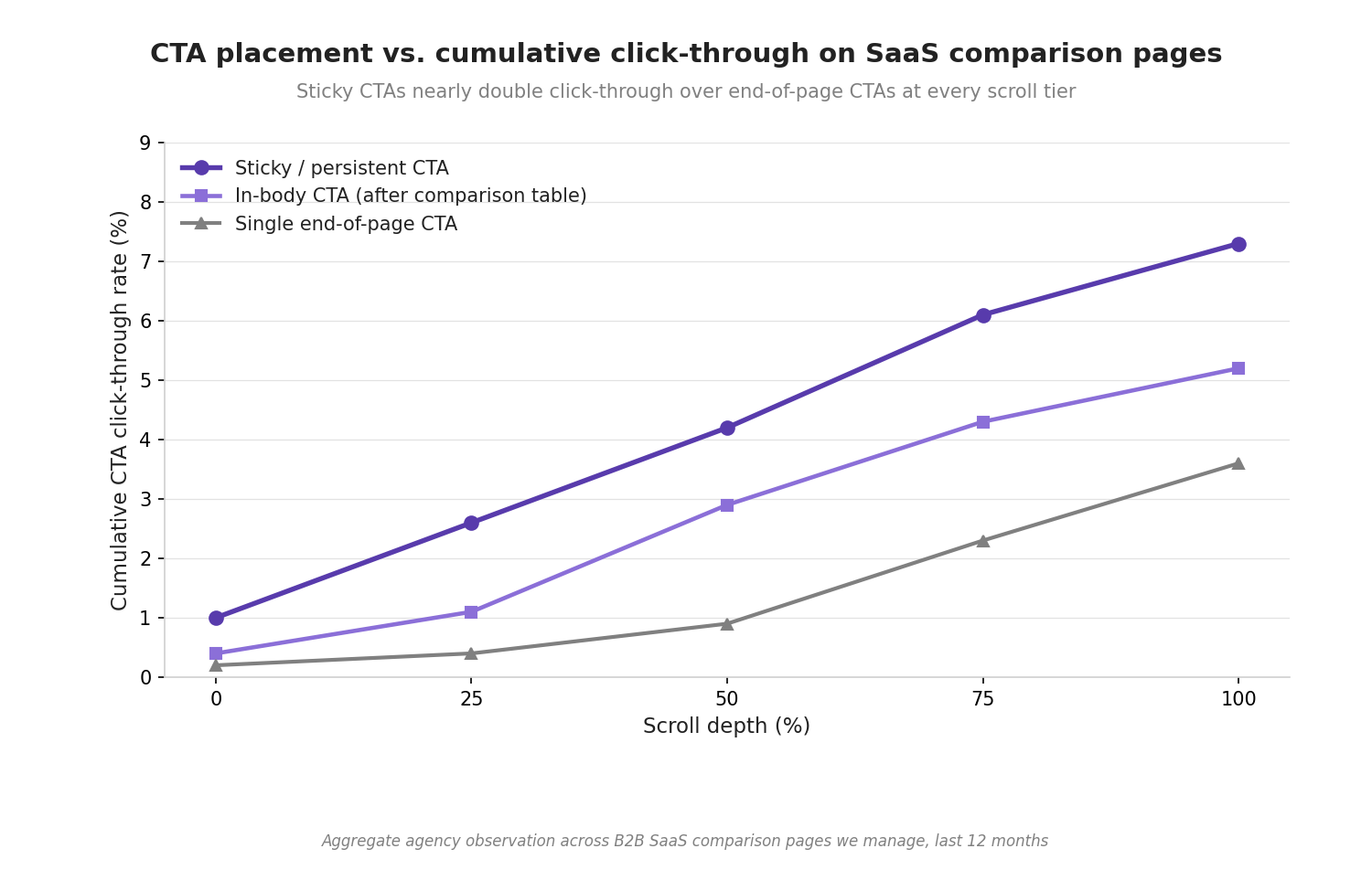
Finally, track scroll depth, time on page, and click-through rate. These tell you how the comparison page performs and where to refine structure over time. For a deeper dive into measuring these, see our guide on SaaS CRO.
What Should You Avoid When Building Competitor Comparison Pages?
If a competitor page feels too pushy, vague, or unfair, visitors won't trust it. These are the four most common errors we see across audits — and how to fix each one.
Why Do Direct Negative Claims Backfire?
Directly attacking competitors may feel satisfying in the moment. But it does more harm than good.
A claim like "Competitor X is terrible for customer support" doesn't build trust. It creates a negative tone that deters prospects. Instead, frame the comparison factually: "We offer 24/7 customer support, while Competitor X's support hours are limited to business hours."
That stays factual and positions you positively without disparaging anyone. Stick to sourced claims — link to G2 reviews, Capterra ratings, or the competitor's own pricing page when possible.
How Does Too Much Text Hurt Conversion Rates?
No one wants to read a novel on a comparison page. People want answers quickly.
Break your content into digestible pieces — bullet points, tables, and visuals that highlight key differences. Your goal is to deliver value instantly. If it takes too long to find what they need, they'll bounce.
A Minuttia keyword study of 4,523 comparison-query SERPs found that the top-ranking pages consistently used scannable formats — tables, checkmarks, and short paragraphs — over long-form prose.
Why Is Ignoring Mobile Optimization a Conversion Killer?
With over half of web traffic coming from mobile, your comparison page must load fast and function well across screen sizes.
Text, comparison tables, and CTAs all need to work on every device. If your page isn't mobile-friendly, your conversions will drop — often in ways Google Analytics masks until you segment by device.
Test your comparison tables on mobile specifically. Horizontal scroll tables often break the experience. Consider stacking features vertically on smaller screens.
How Should You Handle Buyer Objections Upfront?
If you focus only on your product's strengths, you miss the chance to address customer concerns. Every prospect carries objections — price, features, usability, migration friction. Address them upfront.
If your pricing is higher than the competitor's, highlight the long-term value or the unique features that justify it. If a buyer hesitates about switching, explain how easy it is to migrate or offer a switching incentive.
The best comparison page examples we've seen dedicate a full section to "Common concerns when switching from [Competitor]" — and answer each one directly.
What Are the Best Competitor Comparison Page Examples?
To give you concrete inspiration, here are four well-crafted competitor comparison landing pages that stand out for their structure, content, and conversion design.
Dyte
Dyte's competitor comparison pages, such as Dyte vs Zoom and Dyte vs Agora, keep things clear and focused. The pages feature clean comparison tables that highlight key features and benefits, making it easy for users to compare Dyte with competitors.
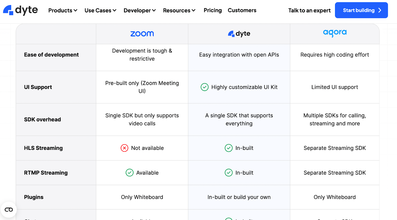
They use color-coded highlights to direct your attention to their strengths and include upfront pricing, which builds trust.
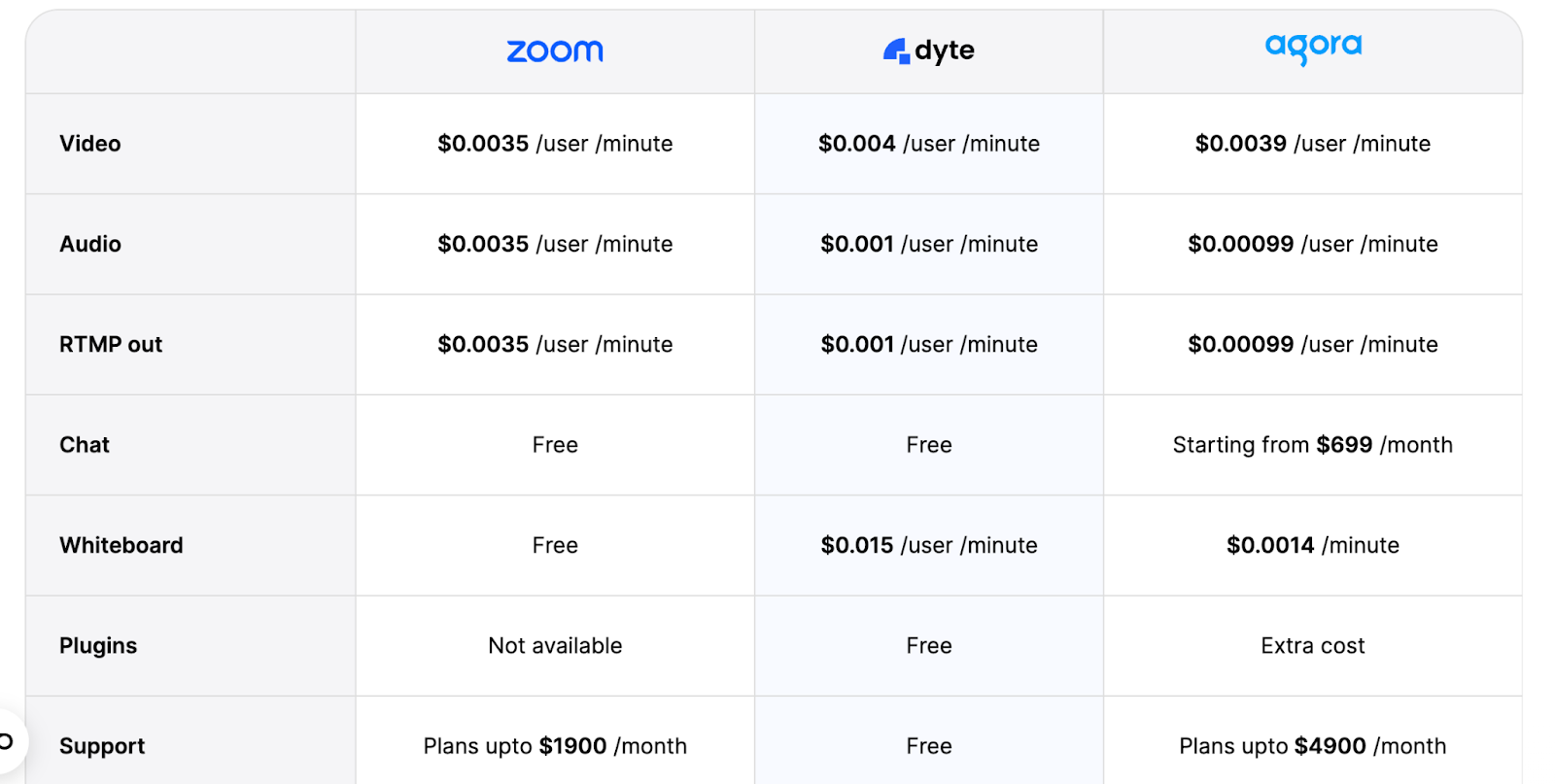
Their CTAs are placed strategically throughout the page, pushing visitors to take action. The entire layout is mobile-friendly, ensuring a consistent experience across devices.
Signeasy
Signeasy takes a user-first approach to competitor comparison pages by focusing on relatable pain points and differentiators without overwhelming readers. Their comparison against SignNow highlights ratings, security features, and advanced capabilities.
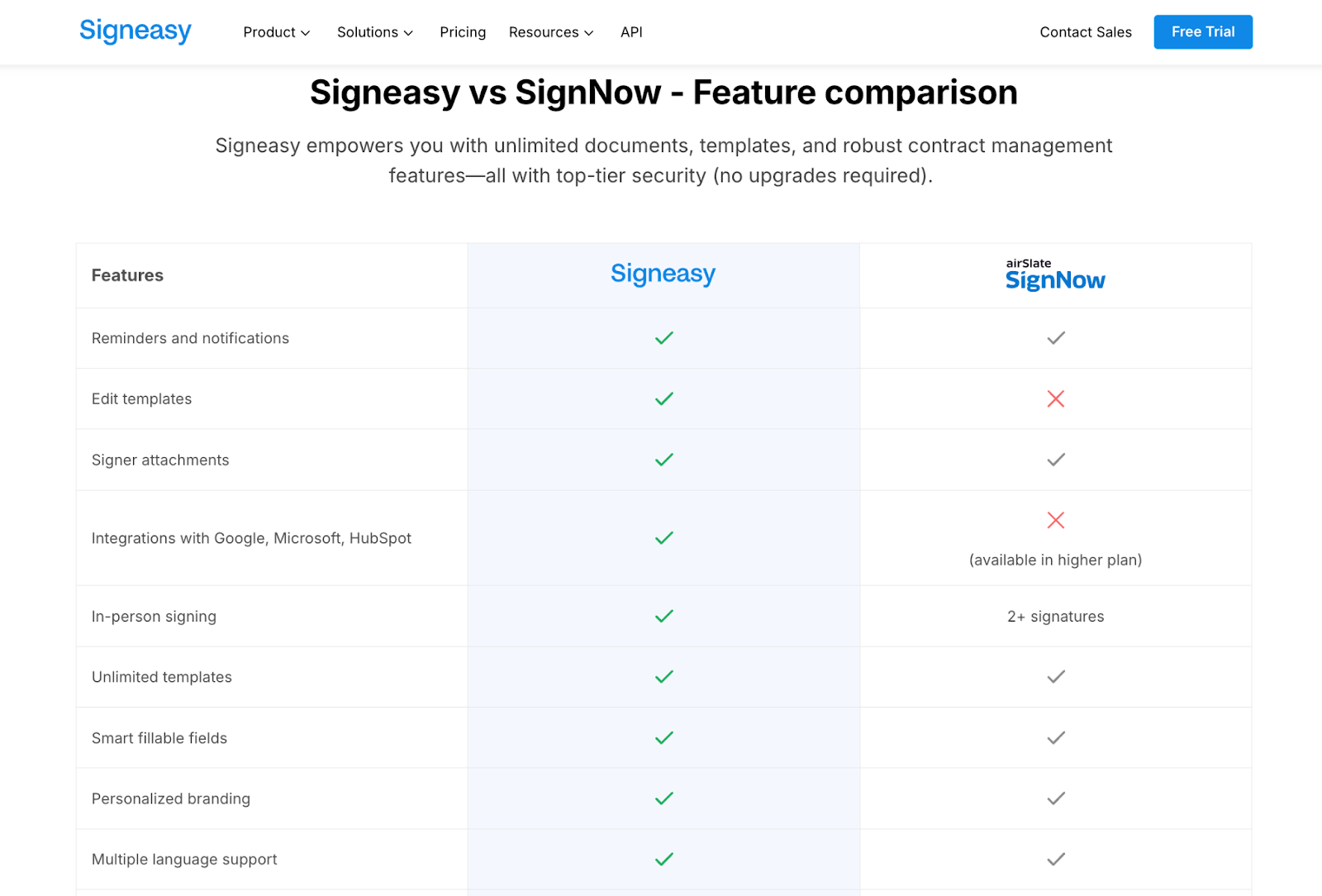
The tone is approachable, and the transparent pricing and strong CTA placement encourage prospects to take the next step without being pushy.
ClickUp
ClickUp does an excellent job creating content tailored for different types of search intent. It offers a comparison page and a blog post for the same query set.
Their PPC-focused comparison page features a clear, benefit-oriented table (especially highlighting the free plan).
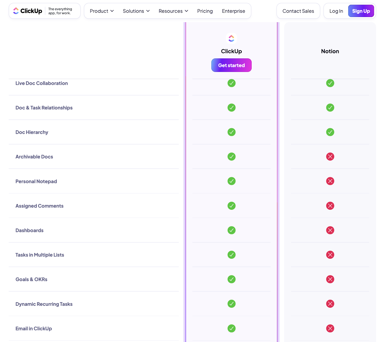
The blog post goes deeper into how they outperform tools like Notion in versatility and customizability.
This dual approach captures both short-term PPC traffic and long-term organic SEO potential. It's a strong template for analyzing competitor landing pages and adapting the structure to your own brand.
Webflow
Webflow's comparison page against Squarespace is a great example of integrating design with function. They use a dynamic scale bar instead of a traditional comparison table, showing which platform excels in different categories.
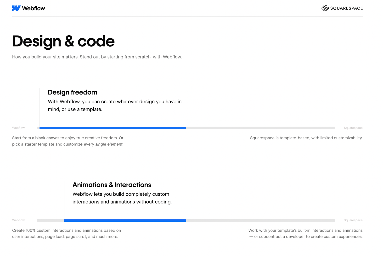
This interactive element makes the comparison visually engaging and guides users through various aspects, from design capability to e-commerce features. The page also includes detailed sections on specific features and ends with customer testimonials, adding credibility.
This thread from r/SaaS shows how other founders have built their own "vs" pages — including practical tips on tools, structure, and what to include: Those who have "vs" comparison pages, how did you build them?
How Is AI Search Changing the Comparison Page Playbook?
AI chatbots now influence which vendor a buyer chooses — and your comparison page needs to be citable inside those answers.
As of late 2025, 51% of B2B software buyers start their research inside an AI chatbot more often than inside Google — up from 29% earlier in the year. 69% of those buyers say they ended up choosing a different vendor than they initially planned because of what an AI chatbot surfaced during research.
That changes what a comparison page has to do. It no longer wins only by ranking on Google's first page. It has to get quoted inside an AI-generated answer when someone asks ChatGPT, Claude, Perplexity, or Gemini "what's the best alternative to [competitor]?"
Four practical changes we recommend for every comparison page now:
- Write answer-first capsules, not wind-up paragraphs. AI chatbots grab the first definitive line. Put the differentiator in sentence one, not sentence four. This is a core principle of answer engine optimization.
- Use named-competitor FAQs. LLMs weight Q&A blocks heavily. A block like "Is [Your Product] a better fit than [Competitor] for [use case]?" with a two to three sentence answer tends to get cited as-is.
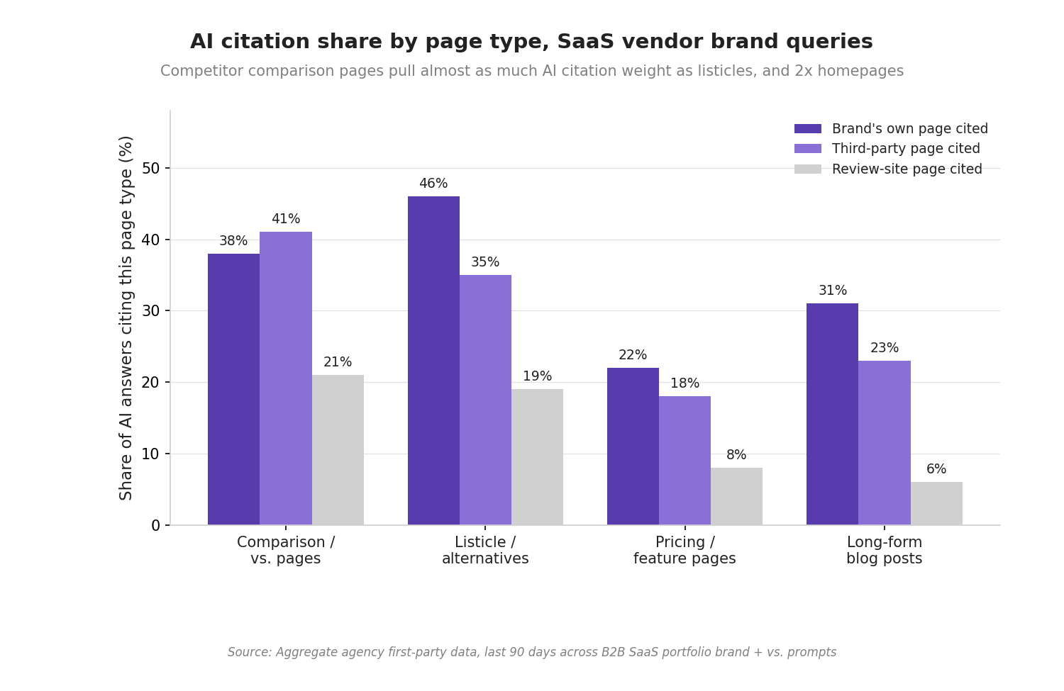
- Build review-site credibility. G2's 2025 research shows 45% of buyers say review-site citations are the single most confidence-inspiring signal in an AI answer. Invest in G2, TrustRadius, and Capterra badge placement, because LLMs cite those pages back into your answer.
- Mind the Reddit pattern. A Minuttia keyword study of 4,523 comparison-query SERPs found Reddit threads appear in 8.12% of them, rising to 63.8% on the most competitive tiers. Communities like r/SaaS and r/bigseo are now part of your comparison-page distribution plan, not a distraction from it.
For a deeper look at optimizing for AI search visibility, see our guide on how to rank on ChatGPT.
Agency Insight
Accounts featuring multiple comparison pages for top competitors — identified via branded search volume — saw 2.8x organic growth in evaluation-stage traffic, with navigation-integrated pages boosting internal conversions by 35% through enhanced user trust and SEO signals.
This Reddit thread from r/SaaS shows the real results founders are getting: one poster built comparison pages for their top five competitors and started ranking for "[competitor] alternative" queries within weeks: Built comparison pages for top 5 competitors. Now ranking for "[competitor] alternative."
How Should You Audit Your Existing Competitor Comparison Pages?
Most B2B SaaS brands already have one or two comparison pages live. The problem? They were built once and never updated. Here is a competitor landing page audit checklist you can run quarterly.
Content freshness check: Are the competitor's pricing, features, and positioning still accurate? Stale claims are a credibility killer and a common reason AI chatbots stop citing a page.
Intent alignment audit: Does the page serve one dominant intent (comparison, alternative, or switching), or does it try to do all three? Split pages that serve multiple intents into dedicated variants.
Schema and structured data: Is your comparison table marked up with Schema.org Product or ItemList markup? Pages with structured data are more likely to earn rich snippets and AI citations.
Mobile parity test: Load the page on three different mobile devices. Do the comparison tables render correctly? Can users tap the CTA without zooming?
Conversion tracking: Are you tracking scroll depth, time on page, and CTA click-through rate? If not, you're flying blind on what's working.
Review-site alignment: Does your G2 or Capterra profile reflect the same differentiators you highlight on the comparison page? Misalignment confuses both buyers and LLMs.
For a full walkthrough of SaaS content audits, including how to prioritize which pages to update first, see our dedicated guide.
Case Study - Atlas HXM
"Atlas HXM improved deal volume by 4x through an inbound engine rebuild, while the MQL-to-Opportunity rate climbed from 41% in Q2 to 55% by Q4, and the Cost per Opportunity dropped by 30%."
Read the full Atlas HXM case study →
How Does TripleDart Build Comparison Pages That Convert?
Customers check off boxes before committing to a purchase. Is the price right? Does it come with solid support? Are the reviews trustworthy? Competitor comparison pages help customers understand why they should choose your product by comparing features, prices, and benefits so they feel confident selecting you over others.
To recap the full playbook:
- Start by targeting the right search intent — whether they're comparing, solving a specific problem, or planning to switch.
- Structure your page for clarity using comparison tables, color-coded highlights, and a visible USP block.
- Acknowledge competitor strengths honestly and highlight where you win.
- Back claims with customer proof — case studies, data, and named testimonials.
- Balance SEO and conversion with persuasive CTAs, schema markup, and topical authority signals.
- Optimize for AI search, because half of your buyers now start inside an LLM.
- Audit quarterly to keep pricing, features, and positioning current.
At TripleDart, we are an AI-native SaaS marketing agency with a portfolio spanning bootstrapped founders, venture-backed scaleups, and publicly traded enterprise SaaS. We help B2B SaaS brands build and distribute high-quality content that ranks, earns AI citations, and converts.
From messaging and structure to visuals and schema, we build comparison pages that control the narrative and convert high-intent traffic into pipeline. Our comparison-page engagements typically cover: competitor universe mapping, intent-specific page architecture, table and USP design, schema and AEO wiring, review-site credibility work (G2, TrustRadius, Capterra), and post-launch conversion optimization.
The result is pages that show up in Google, get cited by AI chatbots, and convert into booked calls.
Ready to optimize your competitor comparison landing pages? Book a strategy call with our team and turn high-intent visitors into paying users.
Frequently Asked Questions
How Many Competitor Comparison Pages Should a B2B SaaS Build?
Start with three: your top direct competitor, your largest "alternative-to" opportunity, and one category comparison that frames your differentiation. Once those three pull ranking and pipeline, expand one page at a time based on search volume and SERP feasibility. Depth beats width here.
Is a Comparison Page Different From an Alternatives Page?
Yes. A comparison page targets "Competitor vs. Your Brand" — a reader evaluating two named options. An alternatives page targets "Competitor Alternatives" — a reader who already dislikes the named option and wants a shortlist. Same money keyword family, different intent, different page shape.
What Conversion Rate Should a Competitor Comparison Page Hit?
The working benchmark is 7.5% or higher for B2B SaaS, per the 2026 Unbounce / SaaSHero data. Pages that dip below 4% usually suffer from one of four things: unclear intent, missing schema, weak CTAs, or poor mobile parity. Audit those first.
How Do I Get My Comparison Page Cited in AI Overviews and ChatGPT?
Three moves: write answer-first capsules under every H2, add a named-competitor FAQ block with two to three sentence answers, and invest in review-site presence (G2, TrustRadius). LLMs quote review-site citations back into their answers, and FAQ Q&A pairs are the easiest format for an AI model to lift. For a full breakdown, see our guide on ranking in AI Overviews.
Should We Name Competitors Directly or Use Generic Descriptions?
Name them. SEO rewards exact-match queries, and buyers searching "[Competitor] vs [You]" expect to see the named brand. The legal risk is low if you stick to factual, sourced claims and avoid superlatives. Generic descriptions dilute both ranking and trust.
How Often Should We Update Competitor Comparison Pages?
Every 90 days at minimum. Competitors change pricing, ship new features, and reposition. Stale comparison claims are a credibility killer and a common reason AI chatbots stop citing a page. Treat the comparison page like a product page, not a blog archive.
How Does TripleDart Help With Competitor Comparison Pages?
As an AI-native SaaS marketing agency, we build intent-specific competitor comparison pages, alternatives pages, and switching guides for B2B SaaS brands. Our team handles competitor research, page architecture, copy, schema, AEO wiring, and post-launch conversion optimization — and we measure success in pipeline, not traffic. Want to see what that looks like for your competitive set? Book a call with our SaaS SEO agency.

.png)


.webp)


.webp)


.webp)

.webp)
.png)


%20(1).png)


.webp)
.webp)
.webp)


%20Ads%20for%20SaaS%202026_%20Types%2C%20Strategies%20%26%20Best%20Practices%20(1).webp)


.webp)


.webp)


![Creating an Enterprise SaaS Marketing Strategy [Based on Industry Insights and Trends in 2026]](https://cdn.prod.website-files.com/632b673b055f4310bdb8637d/6a218bacea463474377dfd32_34%20-%20Creating%20an%20Enterprise%20SaaS%20Marketing%20Strategy.png)


.webp)


%20Agencies%20for%20B2B%20SaaS%20Compared%20(2026).webp)

.webp)
%20with%20Hubspot.webp)


_%20Expert%20Reviews%20%26%20Comparisons.png)


.webp)


_%20Comparison%2C%20Strengths%2C%20and%20How%20to%20Choose.png)


.webp)


.webp)


.webp)


%20Tools%20in%202026_%20Vetted%20List.webp)

![How to Measure AEO Success: 12 Metrics Beyond Clicks [2026 Framework]](https://cdn.prod.website-files.com/632b673b055f4310bdb8637d/6a0d664b326187e99b3d5960_6%20-%20The%20Ultimate%20Guide%20to%20Measuring%20AEO%20Success%20in%202026.png)
![7-Step Workflow for AEO-Ready Content [2026 Framework]](https://cdn.prod.website-files.com/632b673b055f4310bdb8637d/6a0d55ea88913ede1d3a7123_5%20-%20Workflows%20for%20Optimized%20AEO-Ready%20Content%20Creation.png)
.png)

![How to Structure Content for AEO and GEO [With Templates]](https://cdn.prod.website-files.com/632b673b055f4310bdb8637d/6a0c6a56eb700472e635ff33_1%20-%20How%20to%20Structure%20%20Content%20for%20AEO%20and%20GEO%20%20Summaries%20(2026).png)


.png)
.png)


.webp)

%20Agencies%20in%202027.webp)
.webp)
![Top 9 AI SEO Content Generators for 2026 [Ranked & Reviewed]](https://cdn.prod.website-files.com/632b673b055f4310bdb8637d/6a2a3e3105bc1a127aae4e8e_34%20-%20Top%209%20AI%20SEO%20Content%20Generators%20for%202026%20%5BRanked%20%26%20Reviewed%5D.webp)


.avif)