How Arya.ai Launched Infinity OS With a Page That Feels Like Software
About Infinity OS
Arya.ai builds AI software for banks and insurers. They've been at it for over 10 years, mostly on the parts of the business where decisions get made.
In a bank, a mortgage application sits in one system and onboarding a new business customer sits in another. Cheque processing, credit checks and disputes each have their own. Nobody planned it that way, it piled up over the years.
Infinity OS puts all of that in one place and lets teams build agentic workflows on top of it. There are pre-trained apps, frontier models and integrations behind it, so a team can set up a workflow and run it without starting from scratch.
Arya.ai asked us to design the launch page.
Bankers Had to Get It in Five Seconds
Arya.ai wanted a page that feels like an operating system. The product is sold as an OS for banks still running old infrastructure, so a page that only talked about it would have undercut the claim.
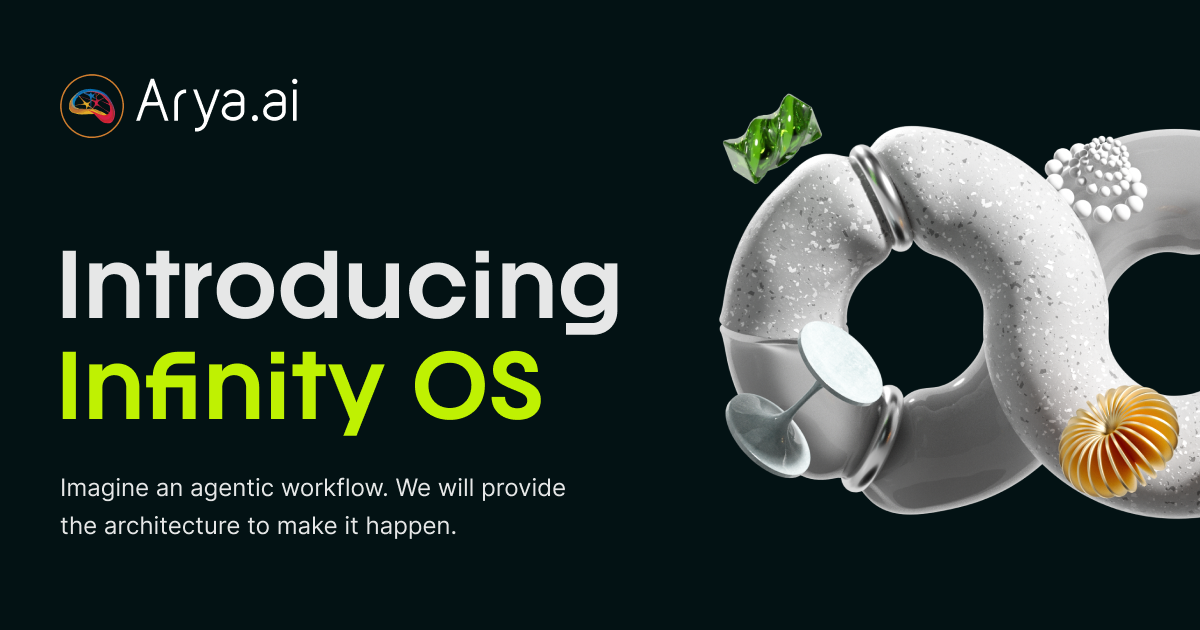
The audience was narrow. People at banks and insurance companies, in mortgage operations or onboarding or credit risk. Most had never come across agentic AI, and had no reason to know what an operating system for their own work would be.
The words were the problem. Agentic workflows, AI orchestration, an operating system for your processes: none of it means much to someone who runs a mortgage team all day.
So the idea had to make sense in a few seconds without being dumbed down, because too simple makes the product look small and too clever makes people stop reading.
The page also had to move. Selling software that reacts to what you give it, on a page that sits completely still, sends the wrong message.
Going in, Arya.ai had a product that could take a bank process from start to finish, and nothing on screen that showed it.
A Screen Inside a Screen
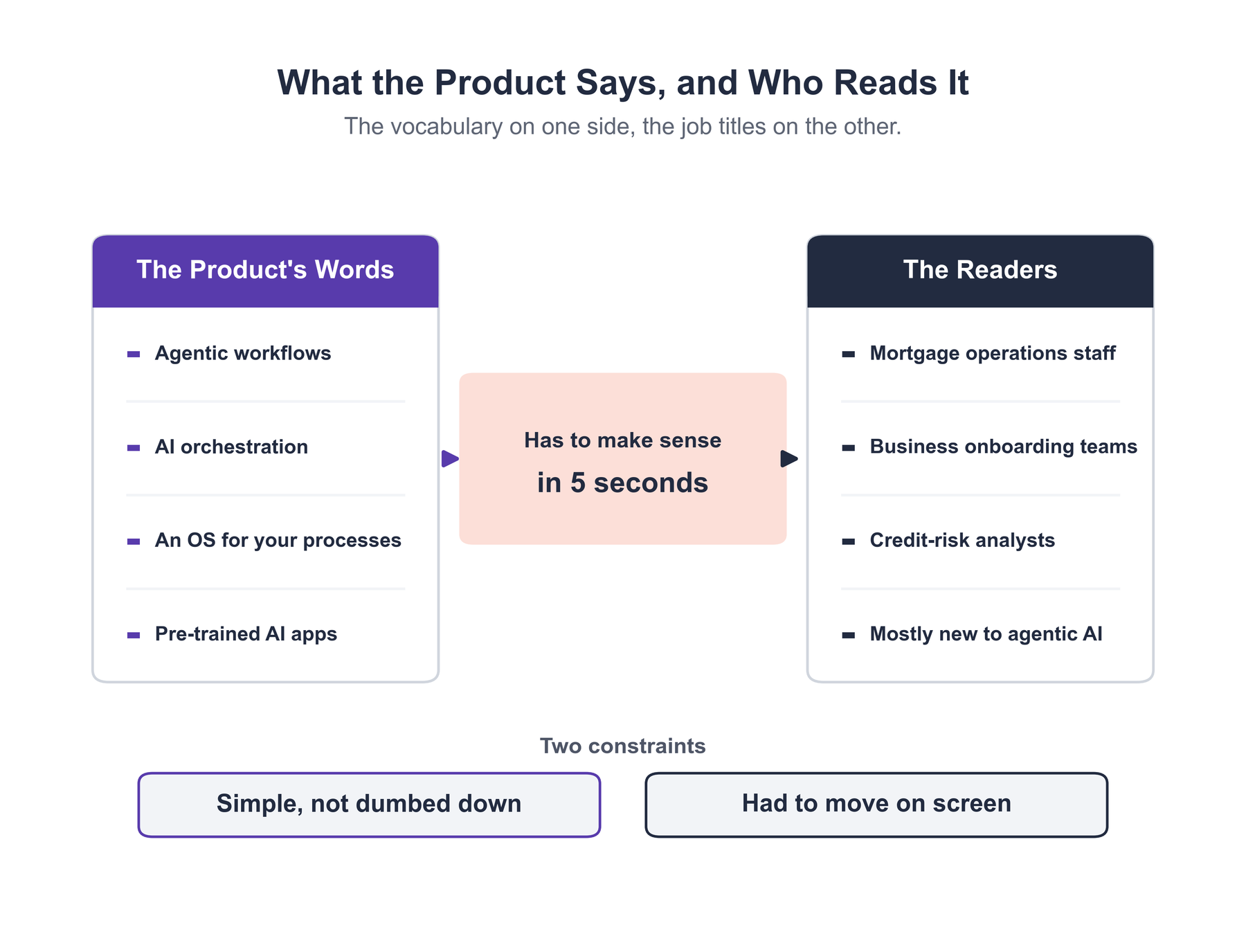
We wrapped the whole page in a thin border, ran small text along the edges, and put status markers in the margins. Above the workflow picker there's a bar with the product name in it, like the top of an app window.
You register it before reading a word. A window frame needs no explanation, so the OS idea comes across without any copy doing the work.
One Object, the Whole Way Down
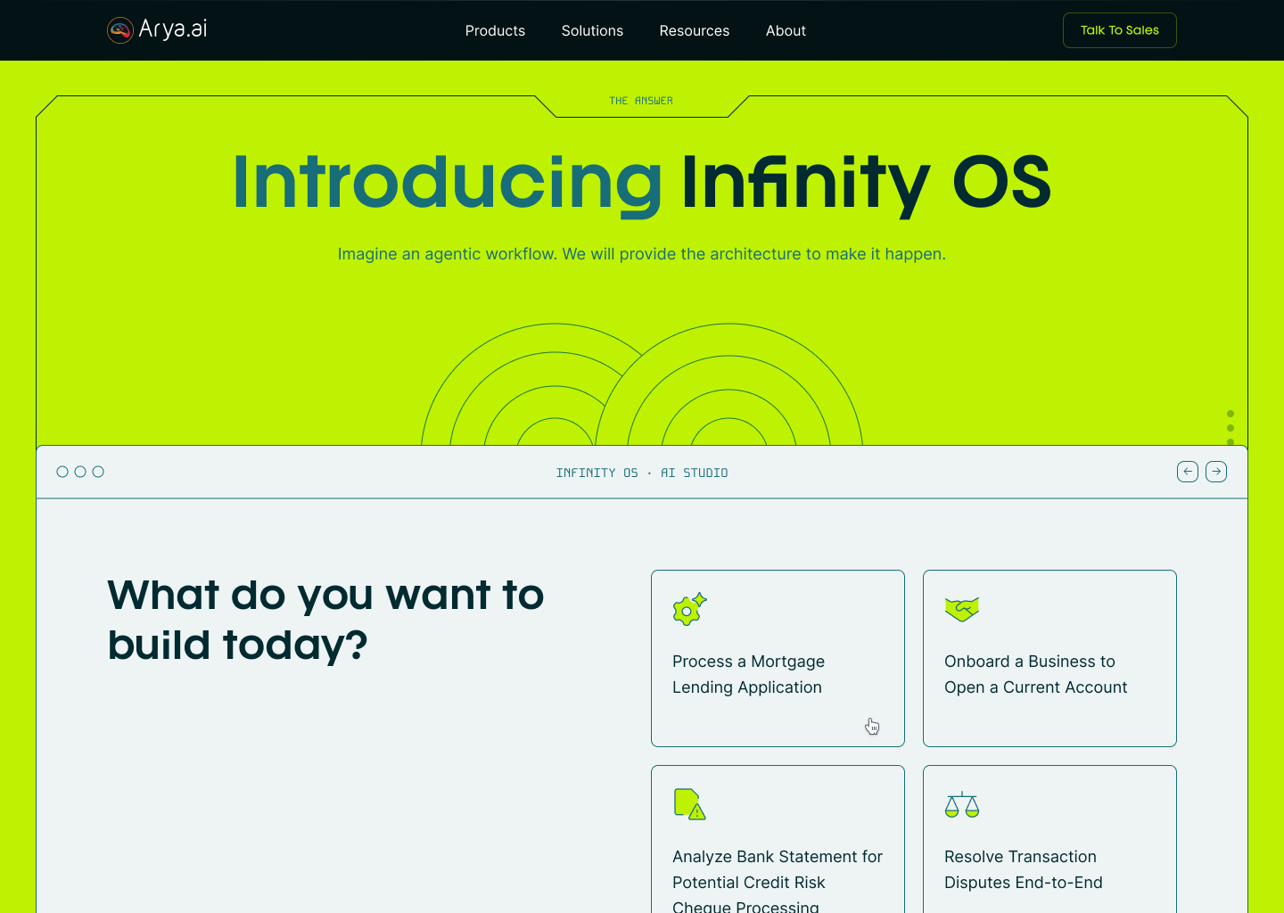
A hero image would have covered the first screen and done nothing after that. So we put a single 3D object on the page and let it move through every section, changing as you pass each one.
It ends up feeling more like a character than a graphic. Chat assistants use small reactive animations for the same reason: when something responds to you, you start reading intent into it. Because the object never leaves, the sections stop feeling like separate slabs.
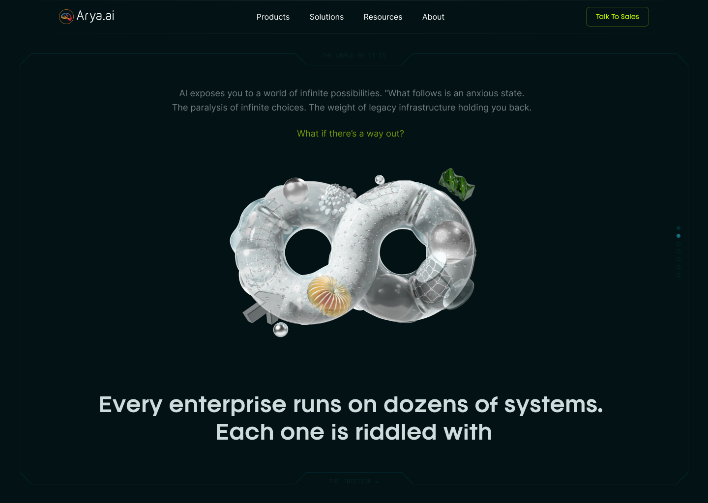
Infinity Was Already in the Name
We spent the most time on which object to use. Abstract shapes came first, and they all had the same problem: a shape that doesn't mean anything has to be worked out before it does any work.
An infinity loop covered a few things at once. Infinite processes, an endless scroll, and the name of the product itself. You see it and the connection is already made.
We found 3D assets with several versions of the same symbol, which is what made it work as a running element. One render gives you a hero image. A set of them lets the shape stay recognizable while it keeps changing on the way down.
A Day Spent on One Transition
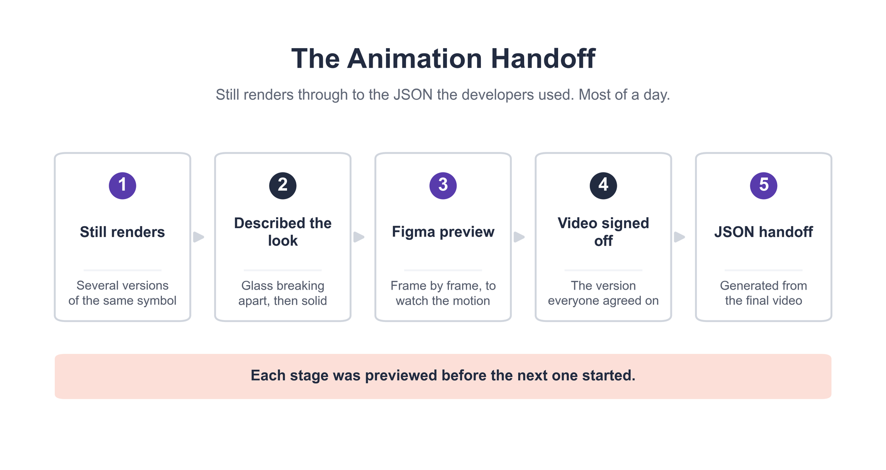
We knew the look we wanted: glassy and breaking apart on the way in, then pulling back together into something solid, like liquid turning to stone.
Describing it clearly enough to build took a few tries. We used ChatGPT and Claude to write out the transition before anyone started building, which saved time once the work began.
Then it had to be something the developers could work with. We tried the transition in a few tools and built it out frame by frame in Figma so we could watch the motion before committing. Once the reference video was right, we ran it through Claude to get the JSON they built from.
That gave the developers one settled spec, with nothing left to guess at.
What the Page Does Now
The page explains itself before anyone reads a headline. The frame makes the software point, the symbol gives the product one face across every section, and the endless scroll matches what Infinity OS says about endless processes.
Most of the work on comprehension came from the infinity shape. Someone from mortgage operations who has never heard of agentic AI picks up the idea in the first few seconds, and the glass turning to stone gives the object enough life that it reads as something responding to you.
What's live is what we previewed, since the animation came out of the approved video as JSON.
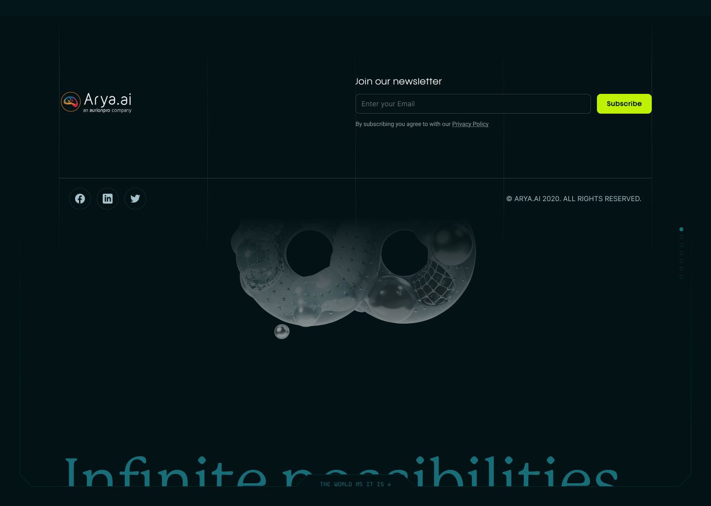
The main risk on a project like this is going too abstract. Bank and insurance staff don't have time to decode a metaphor, so we kept the page literal: a frame you recognize as a screen, a symbol that matches the product name, and a scroll that behaves the way the product describes itself.
The page still shows how much the product is trying to do, which is putting a pile of scattered bank processes in one place. And someone who has never heard of agentic AI can scroll it once and come away knowing what it does.