.png)

Key Takeaways
- A well-designed B2B website captures attention, communicates value clearly, and keeps visitors engaged.
- Simple, consistent visuals, responsive layouts, and intuitive navigation enhance user experience and accessibility.
- Customer-centric content that addresses visitors’ needs and outcomes drives trust and conversions.
- Strategic use of CTAs, case studies, testimonials, and visuals strengthens engagement and brand credibility.
- Iterative testing, analytics, and design optimization ensure the website performs effectively and meets business goals.
Are you looking for some B2B website design inspiration? Then this blog is for you.
For B2B organizations, a perfectly designed website is crucial. It is vital to ensure that your target audience gets hooked on the website’s design and content.
To help you design the best website, we curated a list of the 25 best B2B website design examples.
Check them out! 👇
Basic Elements in a B2B Website Design

Before you start designing your website from scratch, here are a few things you need to consider and create.
- Define your goals: Start by clarifying the objectives of your B2B website. Determine what actions you want visitors to take, such as filling out a contact form, requesting a quote, or making a purchase. Understanding your goals will help you structure your website accordingly.
- Identify your target audience: Research and define your target audience, including their demographics, preferences, and pain points. This information will guide your design decisions and content creation process, ensuring your website resonates with your intended audience.
- Plan your website structure: Create a sitemap that outlines the main pages and their hierarchy. Consider the user journey and how visitors will navigate through your website. Common pages for B2B websites include home, about us, products/services, industries served, testimonials, blog, contact, and a resource center.
- Design the visual elements: Work on the visual elements of your website, such as the color scheme, typography, and logo. Use a professional, clean design that reflects your brand identity and appeals to your target audience. Remember to maintain a consistent design throughout the site.
- Develop a responsive layout: B2B websites should also be optimized for mobile devices. Ensure your website has a responsive design that adapts to different screen sizes and provides a seamless user experience across devices.
- Craft compelling content: Develop high-quality, informative, and engaging content for each website page. Clearly communicate your value proposition, highlight your products or services, and explain how to solve your customers' pain points. Use clear and concise language and incorporate relevant keywords for search engine optimization (SEO).
- Incorporate lead generation elements: B2B websites often focus on lead generation. Include strategically placed call-to-action (CTA) buttons and forms to capture visitor information. Offer valuable resources, such as whitepapers or industry reports, in exchange for contact details to generate leads.
- Optimize for search engines: Implement on-page SEO best practices to improve your website's visibility in search engine results. Use relevant keywords in page titles, headings, and meta descriptions. Ensure your website loads quickly, has clean URLs, and includes alt tags for images.
- Integrate analytics and tracking: Set up website analytics tools like Google Analytics to track visitor behavior, conversion rates, and other key metrics. This data will help you make data-driven decisions and optimize your website over time.
- Test and iterate: Launch your B2B website and monitor its performance. Gather user feedback and make iterative improvements based on data and user insights. Regularly update your website with fresh content, features, and improvements to ensure effectiveness.
Best B2B Website Examples and Key Takeaways
Here are the best B2B websites that have been successful in catching eyeballs and converting visitors, along with how they could do it.
1. HubSpot
HubSpot ranks #1 on our list for the right reasons. The CRM platform has a contemporary website design with a clear value proposition to engage visitors immediately. The highlights of HubSpot's website are:
- Simple layout
- Concise messaging
- Compelling visuals

Key Takeaway
Prioritize simplicity and clarity in design while clearly communicating the value your business offers.
2. Shopify
Shopify is a leading e-commerce platform that enables businesses to create and manage online stores. Their website distinguishes itself with a clean and professional design that focuses on simplicity, ease of use, and the ability to scale. It effectively demonstrates how Shopify empowers businesses of all sizes to succeed in e-commerce.

Key Takeaway
Shopify utilizes a clean design, concise copy, and compelling visuals to demonstrate the value of its solution. The key takeaway with Shopify is to highlight your offerings in a visually appealing and straightforward manner.
3. Reputation Squad
Reputation Squad, as the name suggests, monitors the reputation of businesses online. The website's home page has everything; what they do, their case studies, and their team contact. One thing that makes it unique is that you must scroll the page from right to left rather than scroll to the bottom.
The company managed to have a very simple and one-of-a-kind website that makes visitors stick to the website and keeps them interested.

Key Takeaway
Reputation Squad doesn't have a salesy website. Its website simply depicts what they have done, how reputation can affect the business, and the case studies. It is simple, unique, and interesting.
4. Asana
Asana's website stands out for its simplicity and effective copy. The collaboration tool uses straightforward and engaging copy to communicate what it does and why businesses should opt for it.

Key Takeaway
One thing that stands out on the Asana website is its CTAs. The animated CTAs on the menu tab as well as when a user scrolls is very responsive and intuitive.
5. Stryve
Stryve's website comes with a unique color palette and font style. The brand consistently follows the format on the website. The color palette depicts how the brand is quirky and easier to work with. Their unique font style is professional and stands out.

Key Takeaway
Stryve is consistent with their brand tonality; be it the style, font, casing – and that’s what makes it memorable for anyone who visits it. Due to these reasons, it is very easy to recognize the brand.
6. IBM
55% of the traffic on a website comes from mobiles. Also, Google uses mobile-first indexing, making mobile-responsive websites more important than ever. Here you can see two images of the IBM website, one from a desktop and the other from a mobile browser. The information, images, and navigation on two devices are aligned with the size of the respective screens.


Key Takeaway
Mobile responsive websites are the need of the hour. So, ensure optimizing them for touch screens, design a user-friendly layout, and set responsive backgrounds to make the website function well across different devices.
7. Miro
Miro's website is on the list because of its CTAs. The website CTAs are prominent, rightly positioned, and action-oriented. The language on their signup button is simple: Sign up for free.

Key Takeaway
Use simpler words in the CTAs and ensure they stand out from the rest of the content. You can always do A/B testing to understand which color or text works better.
8. DoneDone
DoneDone's website stands out for its visuals. The extensive use of graphics along with straightforward copy on their homepage paints a clear picture of what the platform offers and how it can help you.

Key Takeaway
Use visuals like illustrations, GIFs, images, and videos that will attract the audience and make them understand your business.
9. Voluum
Voluum has a simple and straightforward website. The platform speaks about its services in a one-liner. Further, you can also find its different features explained in crisp and concise way.

Key Takeaway
You first-time visitors should feel something to keep you on the top of their mind, right? So, stand out in a way that they know what you offer in one-go. Make your one-liner catchy and easy-to-understand.
10. Intellum
For B2B businesses, social proof makes a huge difference. Intellum focuses on highlighting this. They have used the case studies to show visitors how they have impacted the customers. This customer education platform has a dedicated page for its customer success stories that help visitors understand the product and its use cases better.

Key Takeaway
Create a solid case study page that depicts your previous work to establish trust with your target audience. Here are few pointers to keep in mind:
- It is important to mention your strategies.
- Keep the language simple, straightforward, and conversational.
11. Hunch
Client testimonials speak volumes about your product. So, it is important to include success stories to build credibility. Hunch’s website highlights a client testimonial after every feature, saying how the specific feature has helped them. Each testimonial is authenticated with an image, the person's name, designation, and company.
All the testimonials are collected from top-level decision-makers.

Key Takeaway
If you have a good client list who is happy about your product or service, it is important to reach out to them and ask for a testimonial. Ensure that you publish these testimonials on the home page, as it boosts the authenticity of your brand right from the start.
12. Brandtailers
Brandtailers has a unique, thoughtful, and accessible website design. The website is built considering people with special reading requirements, like ADHD, seizures, or vision impairments.
‘Special’ visitors can just switch their respective profiles, making the website easy to understand. One can select the profile by clicking on the icon on the bottom right side of the home page.

Key Takeaway
Making your website mobile-responsive is one thing, but leveraging technology to make it user-friendly for different types of people shows how empathetic your brand is.
13. Acme
Minimalistic websites are on the rise lately. Acme’s website is clean, with minimal content clearly stating its offerings and images. This helps the website load quickly.
The home page has one image with different sections, and clicking on a specific section shows the detailed content. Overall, the website design is simple and easy to understand.

Key Takeaway
Minimalistic B2B website design is not that common, but it makes you stand out and also gives clear information to the visitor without a lot of jargon or images.
14. Adobe CXM
Adobe CXM is a one-page website. The site is interactive, easy-to-navigate and engaging for the users. There are five navigation buttons to the left that guide users through each section of the page.

Key Takeaway
A concise, information-packed copy that clearly conveys what the brand offers is key to engaging users. Additionally, a sample layout and a few relevant graphics are sufficient to make the website intriguing.
15. Pixelgrade
Pixelgrade is another simple yet interesting website design example. Their value proposition communicated in a one-liner and then a CTA taking you to their theme store directly. The website background is purple, which is unique.
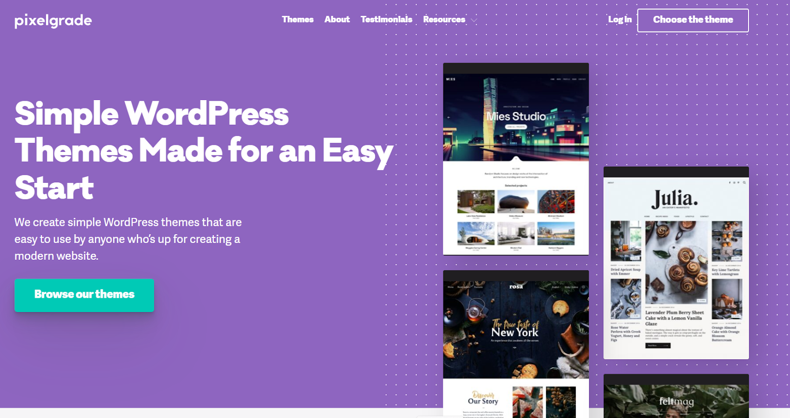
Key Takeaway
Having clear and concise content on your website is a huge plus as it won't overwhelm visitors and conveys what the brand does in a simple way.
16. Hootsuite
HootSuite has a very simple homepage with two lines of copy talking about how their tool can have positive effects on your business. They have shared their value proposition and used statistics to back it up.

Key Takeaway
HootSuite website uses creative copies and statistics to talk about their product. The team have also used different colors to make their copy stand out.
17. Mailchimp
Mailchimp's website focuses on user experience and simplicity. It has an easy-to-navigate interface and concise messaging, highlighting its powerful email marketing features, audience management, and data-driven insights.

Key Takeaway
Just like Mailchimp, it is always important to ensure that your website has a great UI and UX that attracts the visitors and simplifies the navigation for them.
18. Yapstone
Yapstone offers vacation rental payment processing service. Their headline copy talks about how their expertise can help you with the payment system. The website incorporates interesting scenery images on the homepage and has a unique color in the background giving an aesthetic vibe.

Key Takeaway
Use effective one-liners to convey about your offerings. Maintaining the same color palette on all of your website pages can enhance branding.
19. ZenDesk
Zendesk has done an amazing job by focusing their design on “providing great customer support” from the start itself. You will also find statistics on one side of the website. Statistics always have a huge impact on the readers’ minds and Zendesk has done it right. They have also used different colors, like beige for the background and purple for highlighting the text.

Key Takeaway
Just like Zendesk, you can always opt for talking about the value proposition of your company at the start so that any visitor can understand what you are offering immediately.
20. Pulse220
Pulse220 leverages the card design to discuss about its brand. The website’s homepage has a header section followed by cards and testimonials. The visitor who wants to know about their services can click on the respective card for further details.


Key Takeaway
Pulse220 employs a different layout on their website, and this makes them standout. You can always opt for various types of layouts and colors that will give uniqueness for your website.
21. WalkMe
WalkMe's use of a simple UI, highlighting product screenshots and the website copy, is its main attraction. The sufficient use of white space allows users to focus on the main content and images. Also, the dark blue CTA buttons are prominent.

Key Takeaway
Simple website design, copy and highlighted CTAs are enough to keep the audience engaged and WalkMe is on point with all three of these.
22. Orbital Sidekick
Orbital Sidekick uses advanced space-based hyperspectral infrastructure and spectral intelligence to monitor space and gather information necessary for corporates and governments. Their value proposition is very unique, and that is the reason why their website makes it clear in the first header itself.
They create FOMO with the heading and talk about what they offer in the later part.
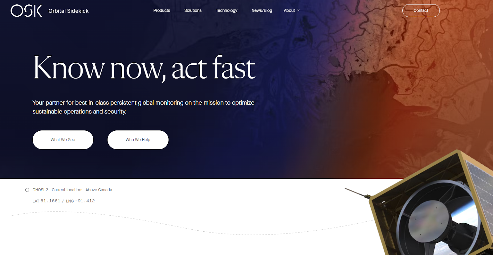
Key Takeaway
Orbital Sidekick simplifies its brand proposition with a few lines of content. They have rightly positioned CTAs and relevant images supporting their work all over the website.
23. Square
Square is a payment platform with a simple, easy-to-understand website with an amazing user interface and navigation facilities. The ample use of white space, cards on its different platforms, images, flow charts, and responsive design make Square stand out.

Key Takeaway
Square has a “Get Started” tab right on the start of the homepage and you can enter all of your relevant details in it to get a personalized experience on the website, which makes it very unique.
24. Netbase Quid
Netbase Quid is another interesting website that plays very well with colors. The company offers multiple products and all of them are displayed on different cards and colors. The website design is very simple, and visitors would understand the company's value proposition with ease.

Key Takeaway
You can use colors to differentiate between different product offerings in your company. Apart from that, leveraging the whitespace effectively can make a huge difference.
25. Weblounge
Weblounge has opted for a classy and minimalist design on their website. The beige background, brown text and font, everything stands out from their competitors. Weblounge has kept their copy simple as well. Visitors will learn what Weblounge offers in the first sentence and the website also has perfectly placed CTAs.

Key Takeaway
Weblounge is all about designing, and their website depicts exactly that. You can see how they have used different colors and layouts to give you that perfect look and user experience.
Tips to Build a Better B2B Website
Here are a few tips to build high-converting B2B websites.

1. Look Beyond Good Website Design
The attention span of users on the internet is decreasing with every passing day. So, catching their interest in the first few microseconds when they visit your website is important. For this, you must have a responsive and well-designed website. Here are a few aspects to keep in mind:
- Visual design: It encompasses the aesthetics of a website, including color schemes, typography, images, and overall visual appeal. Consistent branding and a visually pleasing design create a professional and cohesive look for the website.
- Responsiveness: A responsive design is essential with the increasing use of mobile devices. It adapts its layout and content to fit different screen sizes and resolutions, ensuring a consistent user experience across devices.
- Loading Speed: Slow-loading websites can lead to a poor user experience and higher bounce rates. Optimizing website performance, such as minimizing file sizes, leveraging caching techniques, and utilizing content delivery networks (CDNs), improves loading speed and enhances user satisfaction.
- Usability: Usability refers to how easy and intuitive it is for users to interact with and navigate the website. A user-friendly design includes clear labels, intuitive menus, easily readable content, and logical user flows.
- Accessibility: Accessibility ensures that all users, including those with disabilities, can access and use the website. Design considerations for accessibility include providing alternative text for images, video captions, and proper color contrast for readability. As discussed in the above examples, BrandTailers has shown how you can make your website accessible to everyone.
2. Your Website Should Be Customer-Centric
Most B2B websites talk about the brand, its offerings, and various other aspects that are related to the company rather than talking about the customers. When a business does this, it is a huge letdown for the customers.
Every business has its own set of target customers who would identify themselves with any of your products or services. You need to leverage this identification and allow customers to talk about themselves rather than just going on and on about your brand. Apart from that, you should also talk about how they look at you as a vendor.
3. What's in It for the Customers?
Yes, you offer a great product or service, but what is in it for your customers? How would they benefit from the product? How do you deliver their desired outcomes? These are some of the questions that you need to answer.
A visitor is coming onto your website seeking something, and it is up to you to offer it without hassle. Curate your website and content so that it answers customers questions rather than talking about your offerings. For this, you must use customers' language, understand their requirements, and design your website around them.
4. Make Navigation Easier
Navigation has the capacity to make or break your website and there is no exaggeration in that:
- User-Friendly Experience: Easy navigation creates a user-friendly experience by allowing visitors to effortlessly explore your website and access the content they seek. When users can easily navigate through different pages and sections of your website, it enhances their satisfaction. It encourages them to stay longer, engage with your content, and potentially convert into customers. On the other hand, if the navigation is confusing or difficult to understand, visitors may become frustrated, leading to a high bounce rate and a negative impression of your brand.
- Efficient Information Retrieval: Visitors typically visit your website with specific goals and information needs. Easy navigation enables them to find the desired information quickly and efficiently. By logically organizing your content and providing clear navigation menus, visitors can easily locate the relevant sections or pages they are interested in. This improves their overall experience and helps them accomplish their goals, whether learning about your products and services, purchasing, or accessing support and resources.
- Improved Conversion Rates: Effective navigation can significantly impact your website's conversion rates. Visitors can easily navigate to your product pages, pricing information, or contact forms, which reduces conversion friction. Clear calls-to-action and intuitive navigation paths guide users toward desired actions, such as purchasing or filling out a form. By streamlining the user journey and reducing barriers, easy navigation can positively influence conversion rates and contribute to the success of your website.
Wrapping Up

Setting up a B2B website with perfect design and user interface maybe timetaking. But you don't have to worry about this, as TripleDart is here for you. TripleDart has a specialized team of designers and developers who can design a website that aligns with your brand requirements and helps you stand out among the competitors.
You might want your B2B website to be quirky yet professional, or aspire a minimalistic website that stands out. No matter what kind of website you need, TripleDart is here to design it for you. Book an intro call with the team to see how TripleDart can materialize your ideas into a scroll-stopping website!
FAQs
1. What is B2B web design?
B2B web design refers to the process of creating and designing websites specifically tailored for B2B interactions. The goal of B2B web design is to create a professional, trustworthy, and user-friendly online platform that supports B2B transactions and nurtures business relationships.
2. What are some tips for good B2B website content?
Have a clear idea of target audience, maintain clarity about your value proposition, have a proper website layout, compelling content without a lot of jargon, images, animations, and other types of media to keep the visitor hooked.
3. What makes a good B2B website?
Simple design, easy-to-understand content, images, better resolution, faster loading speed are some of the important aspects of a B2B website.
4. What color schemes work well in B2B design?
Some interesting color combinations for the website design are: navy blue and white, black and white, or gray and white, blue and green, beige, cream, taupe, soft grays, red and yellow, orange and blue, or bright greens.
5. What are the best design styles for B2B websites?
The best website designs that so many brands follow are corporate and professional, minimalistic, modern and innovative.
.png)


.webp)


.webp)


.webp)

.webp)
.png)


%20(1).png)


.webp)
.webp)
.webp)


%20Ads%20for%20SaaS%202026_%20Types%2C%20Strategies%20%26%20Best%20Practices%20(1).webp)


.webp)


.webp)


![Creating an Enterprise SaaS Marketing Strategy [Based on Industry Insights and Trends in 2026]](https://cdn.prod.website-files.com/632b673b055f4310bdb8637d/6a218bacea463474377dfd32_34%20-%20Creating%20an%20Enterprise%20SaaS%20Marketing%20Strategy.png)


.webp)


%20Agencies%20for%20B2B%20SaaS%20Compared%20(2026).webp)

.webp)
%20with%20Hubspot.webp)


_%20Expert%20Reviews%20%26%20Comparisons.png)


.webp)


_%20Comparison%2C%20Strengths%2C%20and%20How%20to%20Choose.png)


.webp)


.webp)


.webp)


%20Tools%20in%202026_%20Vetted%20List.webp)


![How to Measure AEO Success: 12 Metrics Beyond Clicks [2026 Framework]](https://cdn.prod.website-files.com/632b673b055f4310bdb8637d/6a0d664b326187e99b3d5960_6%20-%20The%20Ultimate%20Guide%20to%20Measuring%20AEO%20Success%20in%202026.png)
![7-Step Workflow for AEO-Ready Content [2026 Framework]](https://cdn.prod.website-files.com/632b673b055f4310bdb8637d/6a0d55ea88913ede1d3a7123_5%20-%20Workflows%20for%20Optimized%20AEO-Ready%20Content%20Creation.png)
.png)

![How to Structure Content for AEO and GEO [With Templates]](https://cdn.prod.website-files.com/632b673b055f4310bdb8637d/6a0c6a56eb700472e635ff33_1%20-%20How%20to%20Structure%20%20Content%20for%20AEO%20and%20GEO%20%20Summaries%20(2026).png)


.png)
.png)


.webp)

%20Agencies%20in%202027.webp)
.webp)
![Top 9 AI SEO Content Generators for 2026 [Ranked & Reviewed]](https://cdn.prod.website-files.com/632b673b055f4310bdb8637d/6a2a3e3105bc1a127aae4e8e_34%20-%20Top%209%20AI%20SEO%20Content%20Generators%20for%202026%20%5BRanked%20%26%20Reviewed%5D.webp)