The Copywriting Playbook that Helped Restolabs Turn Scrolls Into Sales
A case study into high-performance, low-friction copywriting
See how carefully-chosen words, sharper psychology, and a few perfectly placed decimals helped a restaurant tech company cook up more demos than ever.
🍽️ Meet Restolabs
Restolabs helps restaurants launch their own online ordering system. They charge zero commission while providing full control and complete brand ownership to the restaurants.
Their pitch is powerful: keep your profits, own your customers.
Their audience? Stressed-out restaurateurs with a hundred things to do, wrestling with a short attention span.
They don’t have time for long reads, don’t trust big promises, and have been burned by aggregator platforms that charge 30% off every order.
To win them over, we wanted our marketing to be to-the-point, every time.
And that’s what we set out to do.
Our mission was to build that ecosystem, starting from the ad that stops the thumb to the landing page that gets the demo.
💡The Challenge: Selling Logic To A Market Driven By Habit
When we started working with Restolabs, we realized their biggest competitor wasn’t DoorDash, Uber Eats, or Grubhub.
It was inertia.
Restaurant owners knew they were losing margins. But they’d accepted it as “the cost of doing business.”
Our job was to shake that belief system and build a new one:
Owning your ordering isn’t complicated. It should be instinctive.
We had to simplify the message, make the math irresistible, and get them to visualize the benefit.
So, we redesigned everything — from the landing pages to the ad creatives — with one obsessive question guiding us:
“How can we make the decision to switch to Restolabs feel emotionally obvious and intellectually effortless?”
✍️ The Copywriting Philosophy
We built a conversion architecture powered by five copywriting principles:
We made every headline, subhead, and CTA an emotional trigger disguised as a business statement.
Step 1: Create Ads To Reel In the Right Clicks
We knew the target—a restaurant owner—is obsessed with two things: Time and Money.
We created 24 high-conversion creatives, each built around a specific psychological trigger. Here's how we made them work.
Strategy One: Making the Price Feel Absurd (In a Good Way)
Restaurant owners are cost-sensitive. Throwing a monthly price at them triggers immediate mental math and hesitation. So we didn't.
Instead, we anchored the cost to everyday purchases.
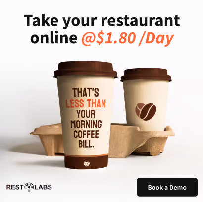
"Take your restaurant online at $1.80/day. That's less than your morning coffee bill."
Another variant: "Own your online ordering at $1.80/day. Less than a pizza slice."
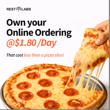
When you compare a business tool to a latte or a slice of pizza, the brain stops seeing it as an expense and starts seeing it as negligible.
Strategy Two: Quantifying the Theft
People will work harder to avoid losing $100 than to gain $100. We weaponized that.
"One day of UberEats fees = One month of Restolabs orders."
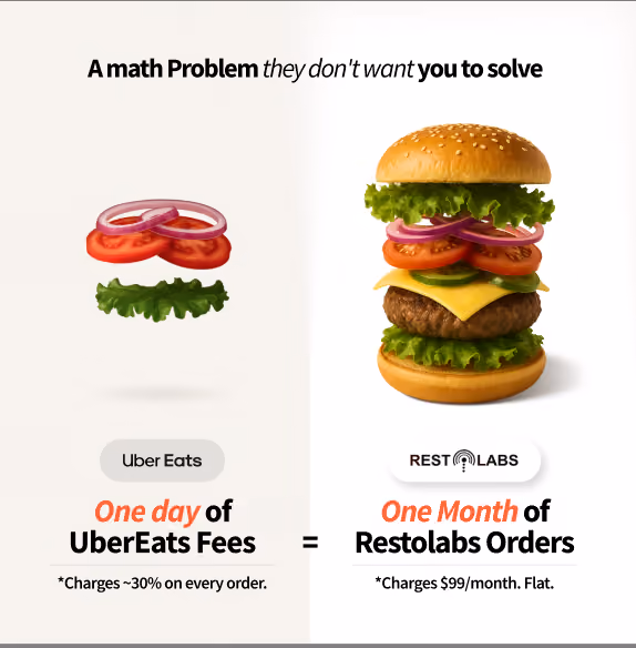
We didn't need to explain commission structures or platform economics. We just showed them what they were losing every single day.
Another version hit even harder: "Stop paying DoorDash 30% commission on every order.
For what, exactly?”
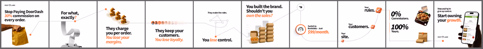
In the carousel ad, we highlighted that users lose margins, control, and ownership of sales. We wanted the viewers to face the answers and be uncomfortable.
Strategy Three: Speaking Directly to the Niche
Generic ads get generic results. We wrote ads that made specific restaurant types feel seen.
"Direct Online Ordering Built for Pizzerias."
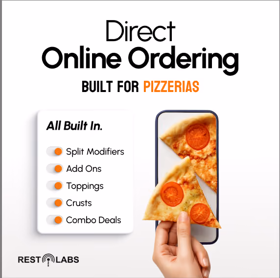
We did the same for coffee shops, catering operations, and multi-location restaurants. Each ad spoke the language of that specific niche, proving we understood their unique operational challenges.
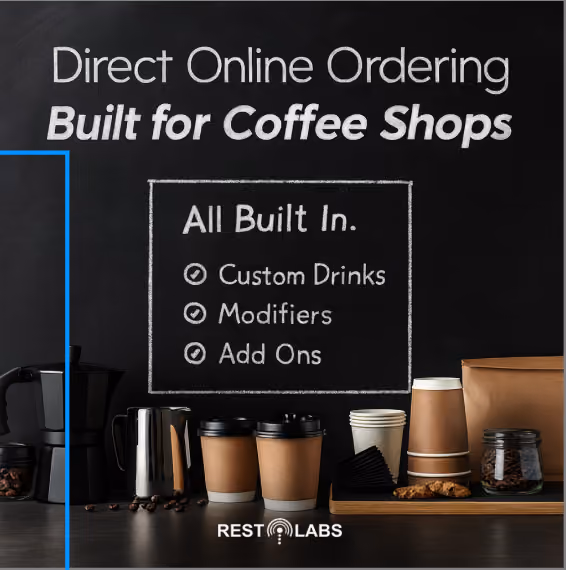
The psychological effect was immediate: "This isn't for restaurants in general. This is for me."
Strategy Four: Using Social Proof for FOMO
Big numbers help establish credibility fast, and we used them liberally.
"2,000+ restaurants saved $3.9M in commissions. Why not you?"
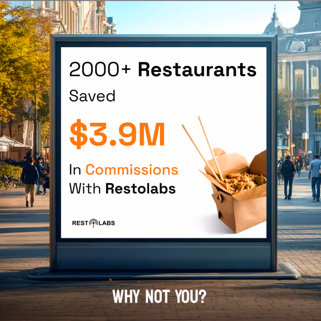
The number was large enough to be impressive, specific enough to be credible. And the closing line, "Why not you?" created a subtle FOMO pressure. If 2,000 restaurants had already figured this out, staying on aggregators started to feel like being left behind.
Strategy Five: Selling the Dream to Partners
For the B2B reseller audience, we flipped the narrative. Restaurant owners wanted to save money. Agencies and resellers wanted to make it.
"Earn 40% recurring commissions."
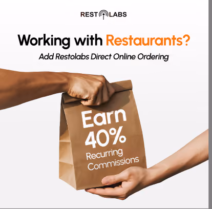
That was the headline. Bold, clear, and unavoidable.
We backed it up with peer-validated success: "Restaurant web design agencies are already earning $20K every month."
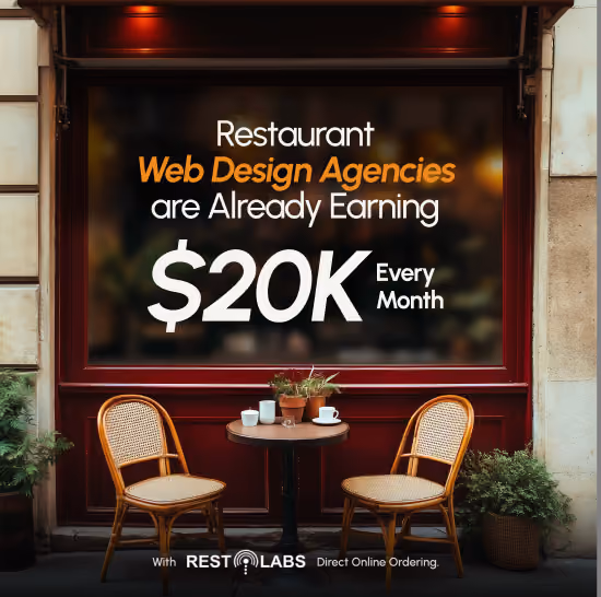
If your competitors were making $20K a month reselling Restolabs, you would want to catch up.
Another angle attacked the friction directly: "Why resell Restolabs?”
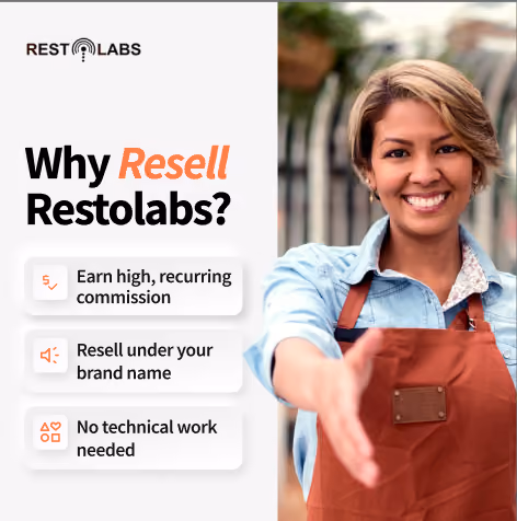
Three bullets. Three objections handled. The ad was written to retarget the viewers who were already interested and just needed the practical details.
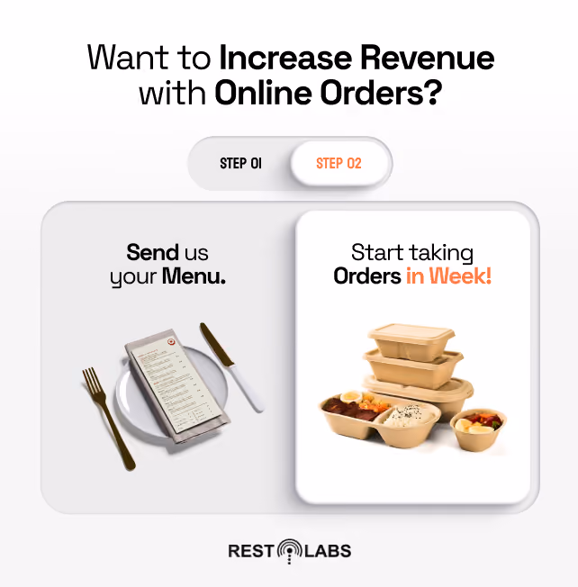
Strategy Six: Removing the Complexity Barrier
The biggest unspoken objection was the assumption that switching would be complicated, time-consuming, and risky.
We killed that fear with simplicity.
"Send us your menu. Start taking orders in a week."
For catering operations, we went even more specific: "Catering made easy. Receive orders three months in advance."
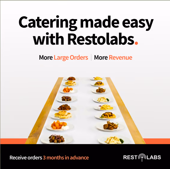
The ad helped restaurant owners visualize locked-in catering revenue months before the event effortlessly.
⚙️ The Subtle Copy Tricks That Moved The Needle
Step 2: Building Landing Pages That Lock In
Once the ads get clicks, it becomes the job of a good landing page to unlock conversions by systematically dismantling every objection.
Strategy One: One Message, One Action
The foundation of the entire funnel was Restolabs’ main PPC landing page. We treated it like the homepage of a high-converting SaaS site.
Headline: "Keep 100% of your profits with the best online ordering solution for restaurants."

Four things happened in that single sentence:
- Stated the outcome (revenue growth)
- Named the villain (commissions)
- Offered a clear promise (online ordering)
- Kept it conversational
The rest of the page followed a strict single-CTA philosophy. Every section, every fold, every piece of social proof led to the same action: Book a demo.
We structured the page to answer one question per scroll:
- What is Restolabs?
- Who uses it?
- Why do they like it?
- What are its features?
- How much will I actually save?
- Will it work with everything else I use?
Strategy Two: Visualizing Self-generated ROI
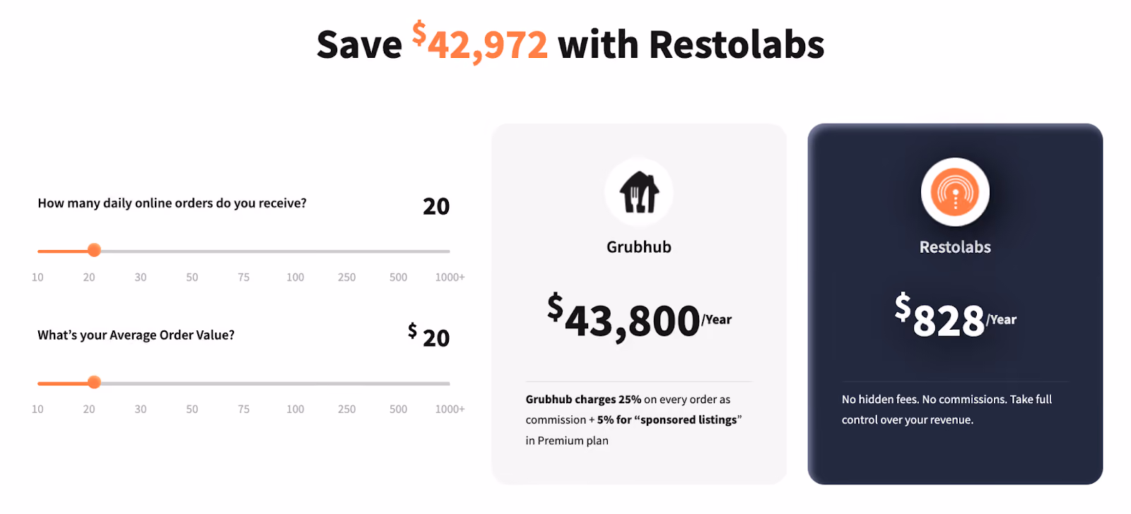
We deployed the most potent conversion tool: the Interactive Calculator.
We placed it in the first fold. Two simple inputs:
- Average order value
- Orders per day
The calculator instantly showed how much they'd keep with Restolabs versus how much they'd lose to aggregators.
This was psychological genius. We weren't making claims anymore. The visitor was calculating their own personalized ROI. The proof was self-generated, which made it undeniable.
A prospect who calculates a $36,500 annual savings themselves will always trust that number more than if we tell them.
Strategy Three: The Architecture of Persuasion
Once the foundation was solid, we went for the jugular: direct comparison pages against the major aggregators and competitors.
We built dedicated landing pages for DoorDash, UberEats, Grubhub, ChowNow, and Owner.com. Each one followed the same strategic structure, but the copy was tailored to the specific pain points of each platform.
- The Psychological Architecture
Every comparison page was built on loss aversion. People don't act to gain something. They act to stop losing something.
So instead of saying "Save money with Restolabs," we said: "Stop paying 30% commissions to DoorDash." The pain became personal, which caused the urgency to become immediate.
Testimonials were also placed high in the third fold to instantly back up the initial aggressive claims. This framed the action as a validated, smart trend that the user was simply joining.

- The Readable Blueprint
In every landing page we wrote, the narrative was structured for Max Readability, moving logically from Opportunity Hook to Product Benefits to Pricing Options.
In many variations, we included a clear Trial Period Offer in the final fold. This is the ultimate tool to convert prospects "on the fence," neutralizing the risk of commitment with a low-friction entry point.
Strategy Three: Using Visual Shortcuts
Right below the calculator in the comparison landing pages, we deployed scannable comparison tables.
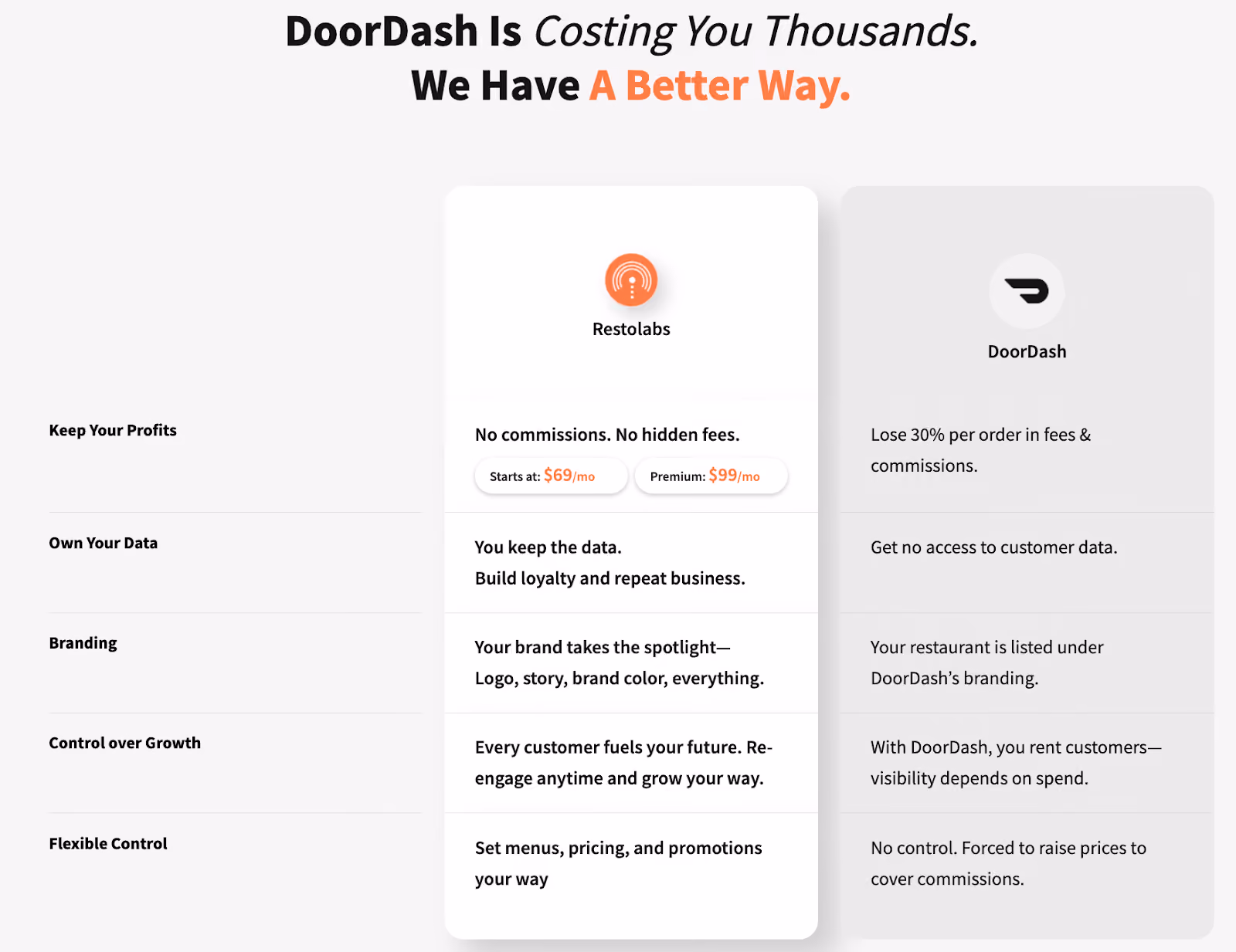
Three seconds. That's all it took for a visitor to see: "I'm losing money and control."
Strategy Four: Validating the Switch
One of the most effective headlines across all comparison pages was this:

"Why successful restaurants are leaving Grubhub for Restolabs."
Notice the framing. We didn't say "Why you should leave Grubhub." We said, "Why successful restaurants are leaving."
This did two things:
- It framed the decision as already validated by peers
- It associated switching with success, not desperation
We ended up framing the switch as a validated, smart, and popular industry trend.
Copywriting that Pays for Itself
The result of this psychological and technical approach to copywriting was a steady uplift in Restolabs' paid marketing performance.
Our work ensured that the high-intent prospect who clicked the ad was met with the exact promise they needed to convert on the landing page, creating a seamless, high-velocity lead flow.
✍️ The TripleDart Copywriting Edge
At TripleDart, we see copy as conversion code. Every headline, every CTA, every tiny comma exists for a reason: to move the user one step closer to saying yes.
With Restolabs, that code clicked perfectly:
- The psychology was right
- The tone was real
- The story was simple
- And the results spoke for themselves
If your ads aren’t converting, if your landing pages feel flat, if your message isn’t sticking, we can help you rewrite the story.